Creating a website for your coaching business is no easy task; with design, copywriting and branding to consider it can be easy to overlook certain aspects of your site.
One of the things that we find is often undervalued when it comes to website design is the call-to-action.
Sure, it might not be the most interesting part of your website to work on – and it’s not the kind of thing to win you any compliments from your friends and peers – but getting your call-to-action right can have a huge impact for your coaching business.
What is a call-to-action?
When people come to your website what do you want them to do? Chances are that you’d like them to provide their email address or get in touch with you so that you can start building a relationship with them. Once you’ve got their contact info, and after a bit of nurturing, you can help them to see you as the solution to their problem and offer them one of your coaching packages (you are selling your coaching services as packages, right?)
Your website call-to-action (CTA) is an important step of helping to turn coaching website visitors into paying clients. Without a clear call-to-action your website is just a place for people to find out about you and your services:
‘Here is a bit of information about me, here are the services that I offer, here is where you will find me’, useful but not necessarily compelling enough for your visitor to want to take any kind of action.
In order to have a website that works for your business you’ll need to offer your would-be clients an obvious next step. Oftentimes, this comes in the form of a problem-solving headline and an action-orientated button. Here are some examples you may have come across online:
- ‘A great night’s sleep, guaranteed’ – Book Now, or
- ‘Hungry? Delivered in 30 minutes or less’ – Choose My Pizza, or
- ‘Get your free 30 Days Of Yoga ebook now’ – Free Download
If you can get the right call-to-action in front of the right people you can inspire them to take the first step, whether that’s to book a call with you or to get on your mailing list.
How to create an irresistible call-to-action for your coaching website
To help you to attract more of your ideal clients we’ve scoured the web for brilliant examples of irresistible life coaching website calls-to-action. Be sure to read to the very end of this post for some tips that will help you craft your own brilliant call-to-action.
1. Marie Forleo
Call-To-Action:
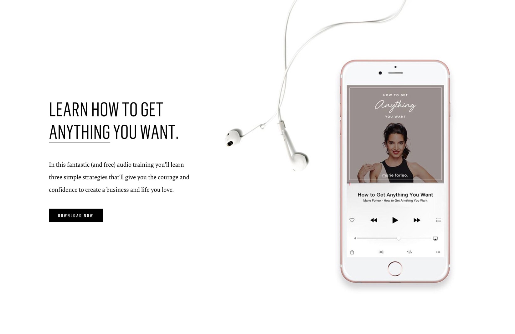
‘Learn how to get anything you want.’ + ‘It all starts with you.’
Why it works:
We know, we know… You’ve seen Marie’s website before – and it has earned a place on our 20 best coaching websites list – but there’s a good reason why it shows up time and time again: Marie’s website is perhaps one of the best – if not the best – coaching website online today.
Where many life coaches would be happy to have one kick-ass call to action on their website, Marie has several on her home page alone.
Although the two calls-to-action don’t appear together on her home page they do pair effortlessly together. ‘Learn how to get anything you want’ speaks to our ambitions while ‘it all starts with you’ is an invitation to own your challenge.
2. Cortney McDermott
Call-To-Action:
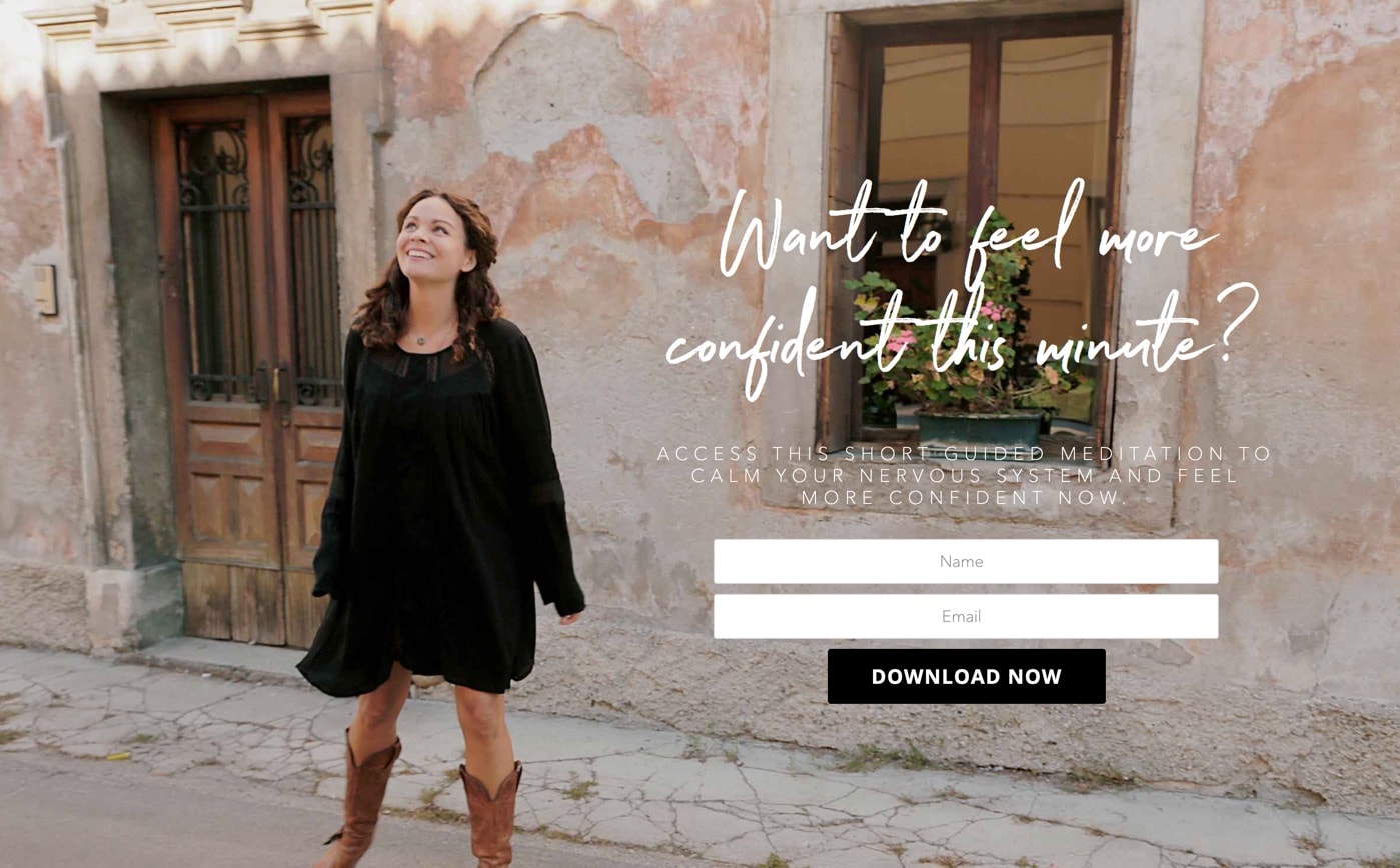
‘Want to feel more confident this minute?’
Why it works:
We love the call to action on Cortney’s website! Not only is it beautifully designed but it is paired with an impactful message and a wonderful full-width image of Courtney. Using an image in this can help to build trust and in this case the image also evokes feelings of happiness and confidence, something which her visitors may want to feel in their own lives.
This call-to-action works so well because Courtney is offering something that she is also able to demonstrate herself. Had the image been of someone sitting in a dark room with their face partially covered then we might not be fully convinced that this person knows how to make us more confident. Thankfully, Cortney has a killer call-to-action that is not only visually impactful but is also combined with an offer that is too good to miss.
3. Simon Alexander Ong
Call-To-Action:
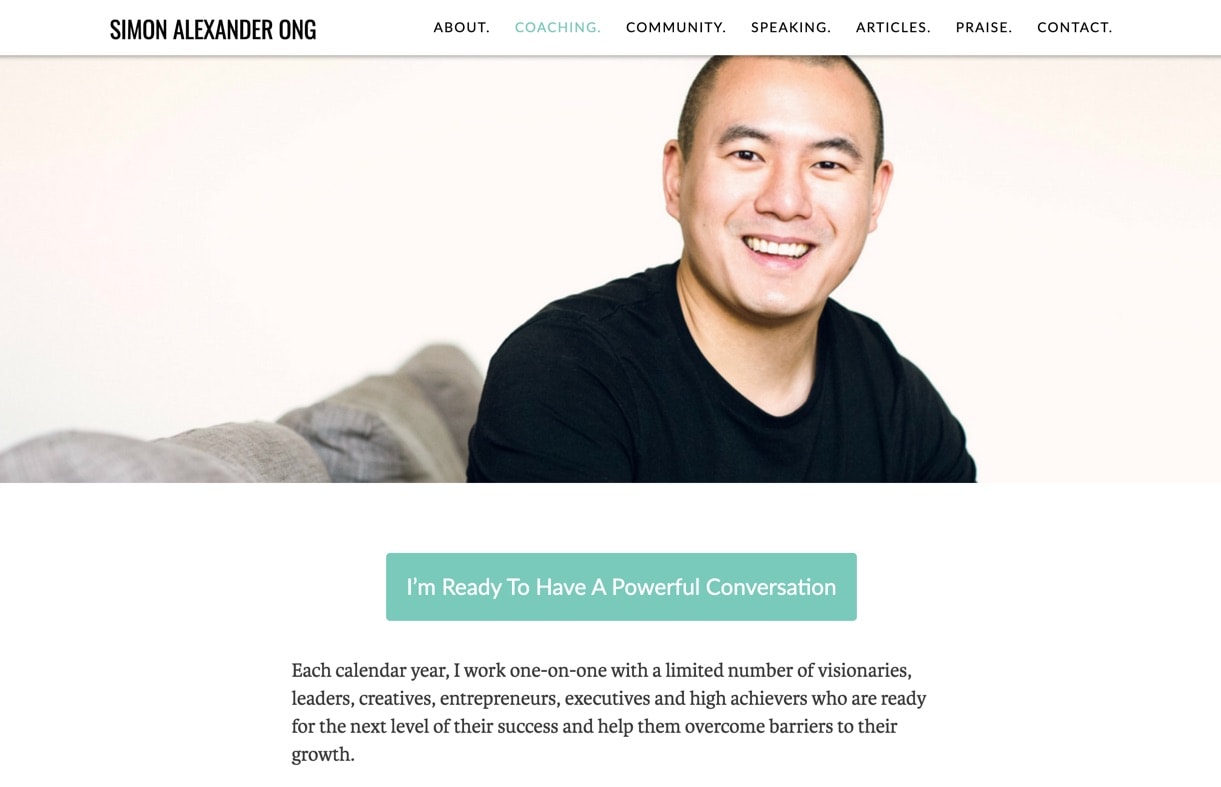
‘I’m ready to have a powerful conversation.’
Why it works:
Demonstrating that your call-to-action doesn’t have to be flashy or have strong visual impact to be effective, Simon takes a ‘less is more’ approach to the call-to-action on his website.
Here the call-to-action works so well due to the limited use of colour throughout the website. Even though the button itself isn’t a bright or bold colour it still stands out alongside the other content on the page. Combine this pop of colour with a strong message and you have an uncomplicated way to help visitors get to where they need to be.
4. Stacey Staaterman
Call-To-Action:
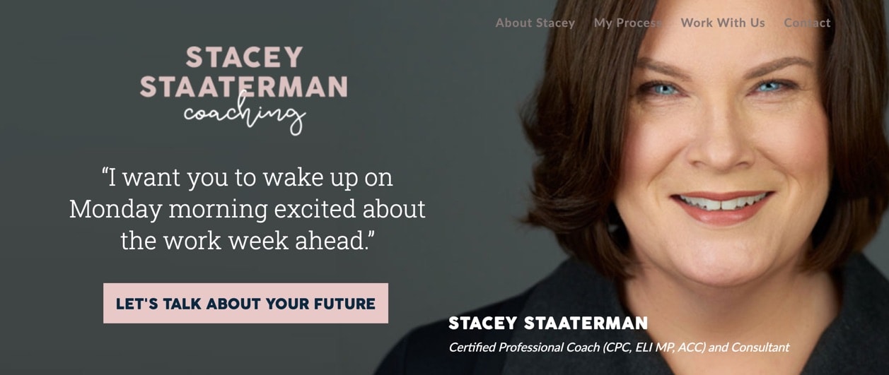
‘Let’s talk about your future’
Why it works:
As we were compiling our list and analysing the different ways coaches frame their call-to-action we kept coming back to this one and appreciating it more each time.
It’s clear that this clever call-to-action has been carefully considered and well thought-through. It’s positioned at the very top of the page, so even if this is the first time you have heard of Stacey everything you need to know is right here: her logo makes it clear that she is a coach, there’s a wonderful photo of her along with her coaching qualifications, and her call-to-action is written with quotation marks to make it clear that she is talking directly to you. It is as if she is sitting right across from us, offering a chance to be more fulfilled and inviting us to talk about it. While her call-to-action can be seen as an invitation to talk it’s also an opportunity for us to think:
What exactly do we want from our future? When was the last time someone asked me this? Come to think of it, when was the last time I asked myself?
With her call-to-action she has not only given us a clear next step but has also given us the opportunity to start a dialogue with ourselves.
5. Heather Waring
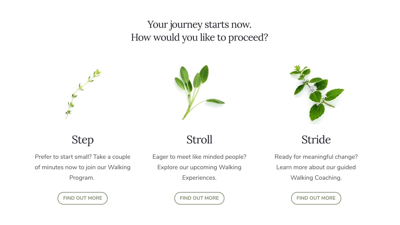
Call-To-Action:
Your journey starts now. How would you like to proceed?
Why it works:
For most coaching websites a single call-to-action will offer the best results. You want your visitors to find your website, hear about your solutions and then take that one action which will begin the relationship with you. But what about when you want your visitor to take the right action for them? For Heather Waring of WomenWalking:WomenTalking a one-size fits all approach wouldn’t be quite as effective, so we were careful to create a call-to-action that would benefit all of her would-be clients no matter what stage they were at. To fit the theme of her business we decided on a call-to-action that was a little more conceptual than you might typically see. Aiming to inspire her visitors to take the first step (pun intended!), we invite them on a journey and ask them how they would like to proceed. Letting visitors decide their own path is a fun way to inspire action and get results. View site6. Brian Tracy
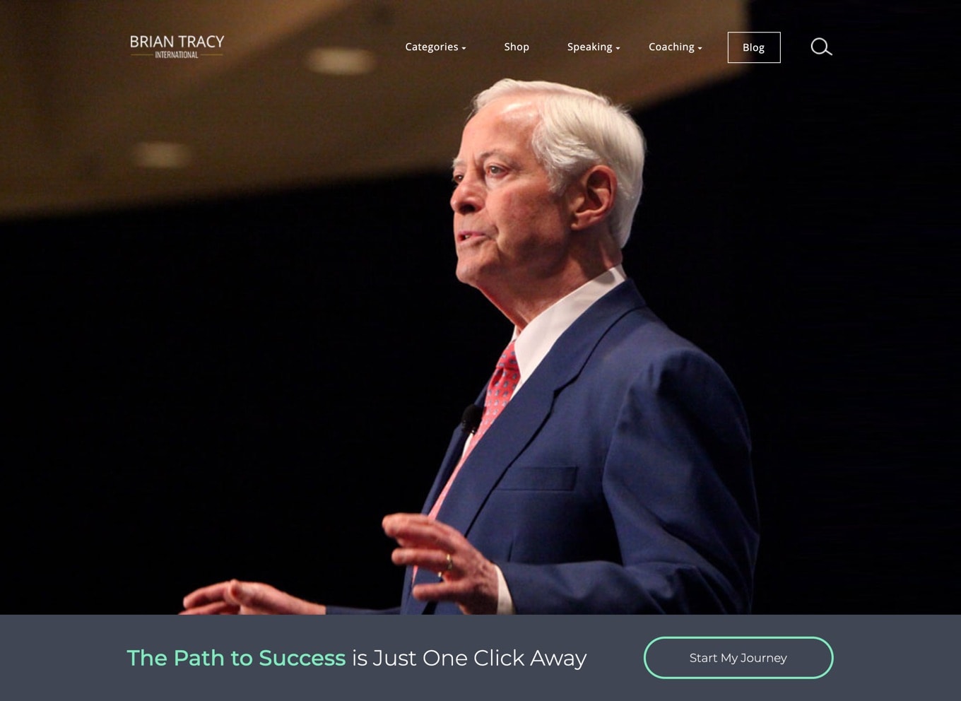
Call-To-Action:
The Path to Success is Just One Click Away
Why it works:
Irresistible. Imagine if everything you wanted from life was just a single click away, would you take it? Brian’s call-to-action is so effective because it is so simple, desirable and is open to interpretation. That said, for many coaching businesses having a broad call-to-action like this on their website might not be such a good idea, here’s why: Brian’s call-to-action is so enticing and the messaging so broad it could result in many of the wrong kinds of people getting in touch. Teachers, public speakers, doctors, photographers – I’m sure we’d all like the path to success, but unless you are at Brian’s level you may not be in the position to help people in the way that he does. And yet, it still doesn’t change the fact that this call-to-action should be incredibly effective. To make a call-to-action such as this work on your own coaching website you may wish to move it to the bottom of your page (Brian has his call-to-action at the top). You can then use your website content to speak to your ideal clients and filter out those who aren’t a good fit, leaving just the ones you’d like to work with to click on your call-to-action. View site7. Meredith Hooke
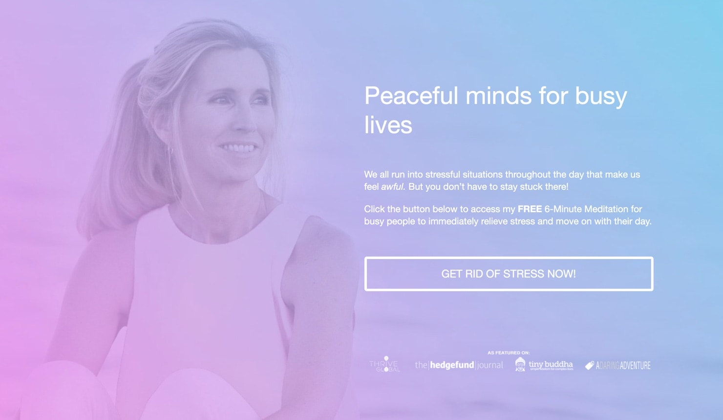
Call-To-Action:
Get rid of stress now!
Why it works:
At first glance the call-to-action on Zensmarts looks radically different from anything else on our list. It’s brighter, more colourful and with language that is perhaps not as punchy as some of the others featured here – but none of these should be viewed as weaknesses. When it comes to creating a call-to-action for your coaching site there is no definitive design or style you have to use. What stood out to us was how Meredith gave her call-to-action a bit more breathing room (which is fitting, considering her goal of teaching people how to meditate). The language feels softer, there’s a welcoming image, social proof to build trust and an action-focused button. Everything she needs to capture the attention of her visitors. View site8. Melanie Tonia Evans

Call-To-Action:
Reclaim Your Life & Break Free From Narcissistic Abuse.
Why it works:
Another firm favourite at The Good Alliance HQ, Melanie has a powerful call-to-action that knows who it is talking to. The purpose of your call-to-action isn’t to compel everyone to take action, otherwise you might end up with lots of leads but very few sales. No, the purpose is to attract the right kind of people, those who you can really help and who will value your services. The call-to-action on Melanie’s website does a great job of letting us know whether we are her ideal client or not. Are we sufferers of narcissistic abuse? If not then we know she isn’t talking to us and we can move on, but if we are then Melanie’s laser focused messaging will connect with us on a deeper level. The call-to-action is completed with a button that reads ‘start healing’; a powerful, respectful and considerate label. To create a call-to-action as effective as this you’ll need to choose a coaching niche and have a good understanding of who you are helping. Although a call-to-action such as this may result in less leads overall, the quality of the leads you do get (and the clients that come from them) should make up for it. View site9. Elizabeth Rider
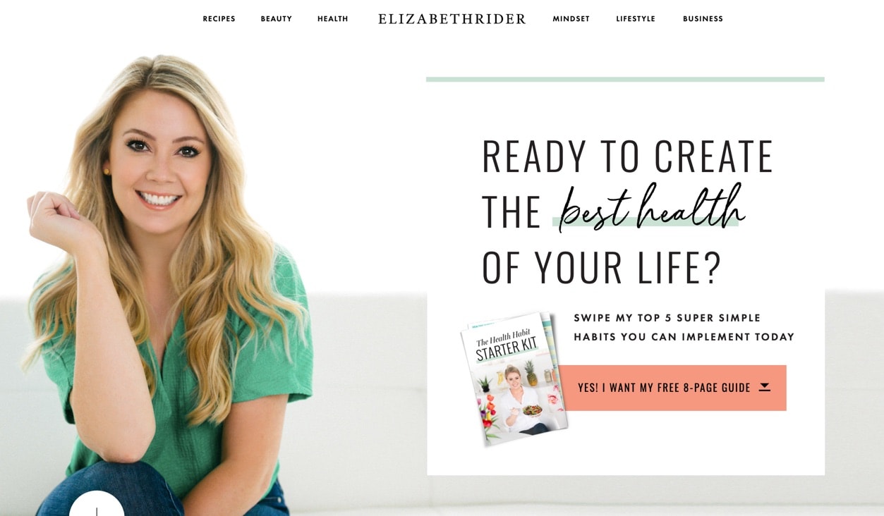
Call-To-Action:
Ready to create the best health of your life?
Why it works:
As we were compiling this list we soon discovered that many of the stronger call-to-actions features on coaching websites were the ones that asked their viewers a question. Here Elizabeth offers a free 8-page guide for anyone who is ready to be in better health. This call-to-action ticks all the right boxes: it’s well designed, the colours are strong, the message is stronger and the ‘Yes!’ button is a brilliant way to let visitors take action. View site10. Loliya Harrison

Call-To-Action:
Discover a 3 step system that will help you reset your body, health and energy levels.
Why it works:
Loliya is a recent graduate of our Brand Bootcamp program and her website is a great example of keeping things simple when you are just starting out. While your call to action is important it’s not the most important thing when it comes to getting your coaching business online. As a health and fitness coach, Loliya’s call-to-action does a great job of enticing her ideal clients with her offer: it’s a step step system with clear benefits and learning about it comes with no strings attached. Although simple, what sets her call-to-action apart is how visually striking it is. If you are in the early stages of building or redesigning your coaching website it’s worth considering how your call-to-action will capture the attention of your visitors. Will it be through exciting language, a too-good-to-miss offer or a strong visual style? To make your call-to-action irresistible it may need to use all three. Though, if you are just getting started with your coaching website it’s best to keep things simple, otherwise your website could become a jumble of half-baked ideas and messaging. As your business grows you can spend time refining your call-to-action to attract your ideal client. View siteWhat makes a good coaching website call-to-action?
We took a deeper look at each call-to-action included in the websites in this list and found that irresistible calls-to-action share some commonalities:
A good call-to-action is larger than life.
While it’s fine to use straightforward language such as ‘book a call’ or ‘get in touch’ you may see better results from your call-to-action if you ask your visitors to dig a little deeper. You can use your call-to-action to invite your visitor on a journey, to begin a powerful conversation or transform their lives.
Stacey Staaterman has a simple but effective example of this for her call-to-action. Instead of a simple call-to-action that says ‘contact me’ she instead has chosen the much more powerful and emotive ‘let’s talk about your future’. While this may seem insignificant in the grand scheme of things, the change of language goes a long way to creating an emotional connection and the message becomes far more interesting.
Consider the language of your call-to-action and try to create a meaningful connection with your website visitor.
A good call-to-action is about loss and gain.
The most compelling coaching call-to-actions are about more than getting in touch with a coach; they offer a chance to either get back something that has been lost or gain something desirable.
Will your call-to-action inspire your visitors to remove an obstacle that is holding them back, or perhaps add something to their lives that will make them more fulfilled? With the right client persona you’ll be able to offer your visitors something irresistible that will enhance their lives and help reassure them that you’re the right person to work with.
Consider words like: reclaim, break free, get rid, create, learn how and want.
A good call-to-action offers instant results.
Want to feel more confident this very minute? Well, who wouldn’t?! The call-to-action that Cortney McDermott uses for her free guided meditation is rock-solid.
Sign up, start listening to the meditation and get results – talk about a quick win!
Offering your visitors a sample of your services without any financial risk to them is an incredibly powerful hook and a great way to introduce yourself to would-be clients.
Consider how you might frame your call-to-action so that it may offer a quick win for your visitors.
A good call-to-action doesn’t overpromise.
As a life coach the urge to tell people that you have the solution to their problems can be hard to resist. But when it comes to creating a kick-ass call-to-action it’s important to manage expectations.
One thing you may notice about the call-to-action featured in our list is that although they offer something potentially life-changing they stop short of saying it’s guaranteed. Here’s an example:
‘The Path to Success is just one click away’ – this may sound too good to be true but remember, Brian Tracy is only offering to show you the path and not to actually make you successful.
Similarly, by downloading a Marie Forleo podcast you can ‘learn how to get anything you want’. But the wording is crucial, she’s not promising to give you anything you want, but instead, she is offering the tools to learn how to do it for yourself.
Consider the implications of your offer; while your visitor should be responsible for their own actions and results, it’s up to you to represent things accurately and honestly.
To see some awesome coaching websites in action, check out some of our other articles, including:
Don’t let your call-to-action let you down!
As your website grows and the traffic starts to roll in you’ll want to be sure that you are making it easy for people to get started with you.
It doesn’t matter how easy it is to book a call with you or contact you via email; if your website doesn’t help people find the pages on your site where they can do these things then both you and your visitors lose out.
If you need to set up a call to action for your website then now is the time. We’re not promising that your call-to-action alone will convert all of your visitors into leads, but we do know that the easier you make it for people to work with you, the easier it’ll be to grow your coaching business.

Brett Worth
Project Success Manager
With a background in web design and development, Brett guides our clients through all aspects of our done-for-you branding experiences.










0 Comments