
The number of people entering the coaching profession is on the up. And the number choosing life coaching as their preferred niche is higher than any other type of coaching.
So, if you’re a life coach, your business has to work extremely hard right now to cut through the noise and stand out. And to give yourself the chance of doing that, your branding has to be consistent across your website, social media and marketing channels.
Get your branding right and you’ll build familiarity and trust with your target audience, resulting in them choosing you over a life coach who’s confusing and inconsistent.
10 inspirational life coach branding examples
We all take inspiration from others, which is why we’ve compiled a list of coaches who have got their branding spot on.
Oh, and make sure to hover over the images below to view the full website.
So, let’s get started…
1. Ami Summers – Craft Coaching & Development
Ami is a coach who helps small business owners develop their creative skills to become more business savvy.
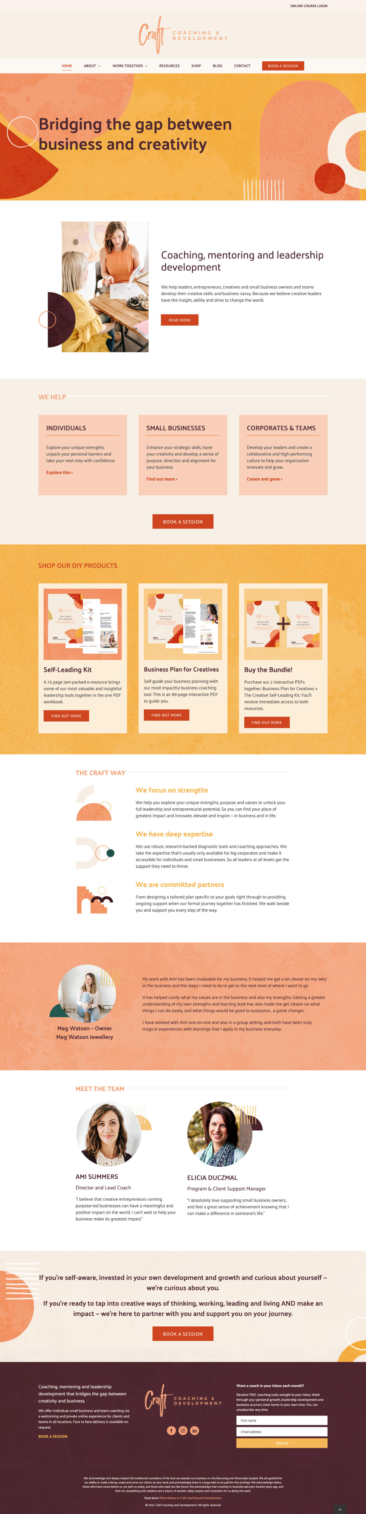
Logo: With Craft all about bridging the gap between business and creativity, Ami’s logo captures that perfectly. Craft looks like it has been written in sweeping brush strokes, while ‘Coaching and Development’ are in a more professional font.
Creativity and business working together in one harmonious logo.
Colour and font: Ami’s website is the most colourful and warm you’ll come across. The red, yellow, pink and white is continued throughout, while the fonts are a little more straightforward and professional.
Once again, it’s a blend of creative and business-like.
Content and tone: The content and tone are less on the chatty, conversational side, but Ami is trying to attract business owners looking to learn how to be more business savvy.
An overly chatty tone here wouldn’t be appropriate, so their professional voice is perfect for the audience, but that doesn’t stop them from using words like ‘jam-packed’, so there’s still a light touch here and there.
Visuals: As you’d expect, the photographs are professional and suit Ami’s audience, but there’s heaps of creativity in the graphic design elements.
Social media: Ami carries the same look and feel onto her social media pages, incorporating the same colour palette, tone of voice and visuals to Facebook and Instagram.
Overall: Ami aims to help businesses bridge the gap between business and creativity, and she does this spectacularly with her branding.
If you’re looking for a coach who practices what they preach, Ami is right up there at the top.
2. Andrea Owen – Your Kick-Ass Life
Andrea is a life coach who helps high-achieving women let go of default behaviours, including people-pleasing, perfectionism and control.
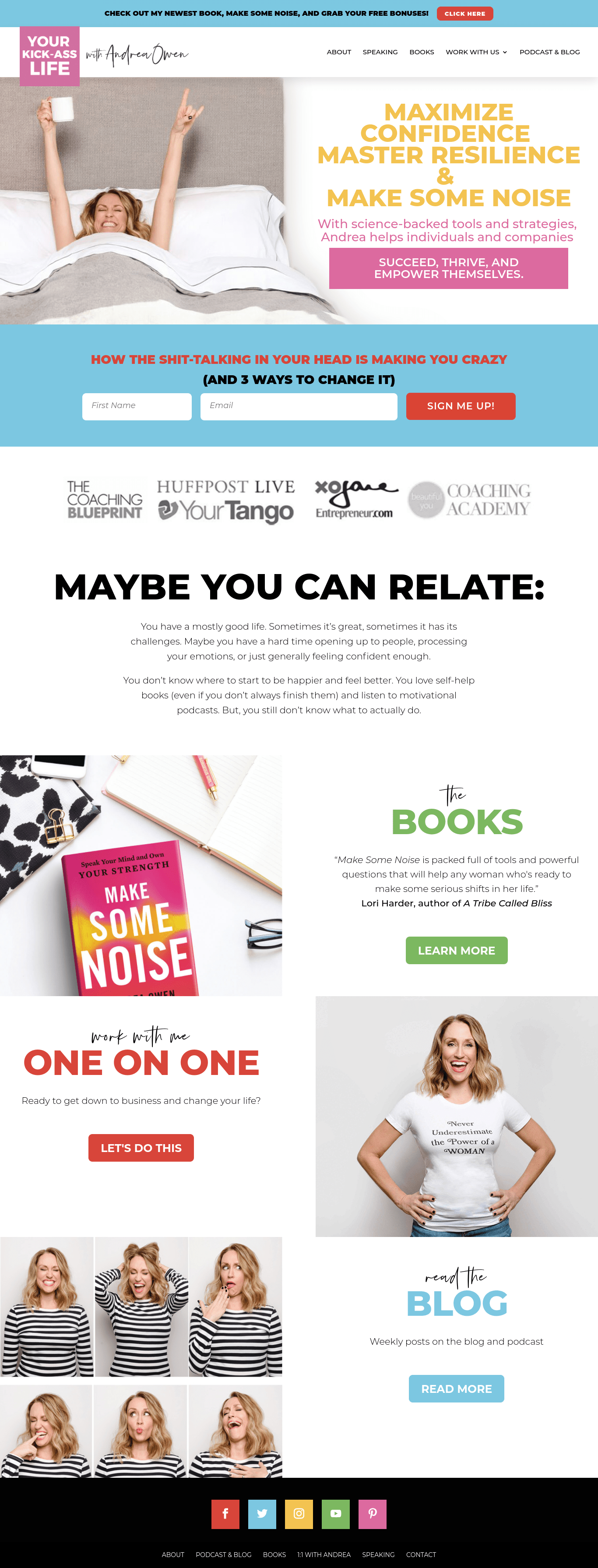
Logo: By calling her business Your Kick-Ass Life, straight away, you know you’re getting a coach who’s laid-back and a little bit cool. And that’s born out in the bold colour and font choice in her logo.
Colour and font: The colour and font choices are just as bold as the logo. To go from bright pink to a dull brown wouldn’t have worked. But by choosing yellow, red, green and blue throughout the rest of the sight, she maintains a light but bold feel.
Content and tone: Andrea’s copy matches her colour choice. It’s light, bright and extremely chatty. She isn’t afraid to swear and her imagery taps into how approachable and fun Andrea is.
Visuals: Andrea’s use of images show how approachable and fun she is. There are no jarring photos of her looking super-professional here. In the header, she’s lying in bed grinning and doing a ‘rock’ sign with her hands. And the rest show her smiling and pulling silly faces.
Social media: Andrea’s colour scheme, fonts, tone of voice and imagery carries over onto her social media, especially Instagram.
Overall: Andrea’s life coach branding is consistent across all her platforms, so it feels like you’re dealing with the same person.
It exudes confidence, which is what she hopes to instil in her clientele. And she really puts her personality out there, making her feel warm and approachable.
3. Christopher Mifsud – Press Start Leadership
Chris helps leaders in the video games industry enable and empower the people around them to grow into something pretty darn awesome.
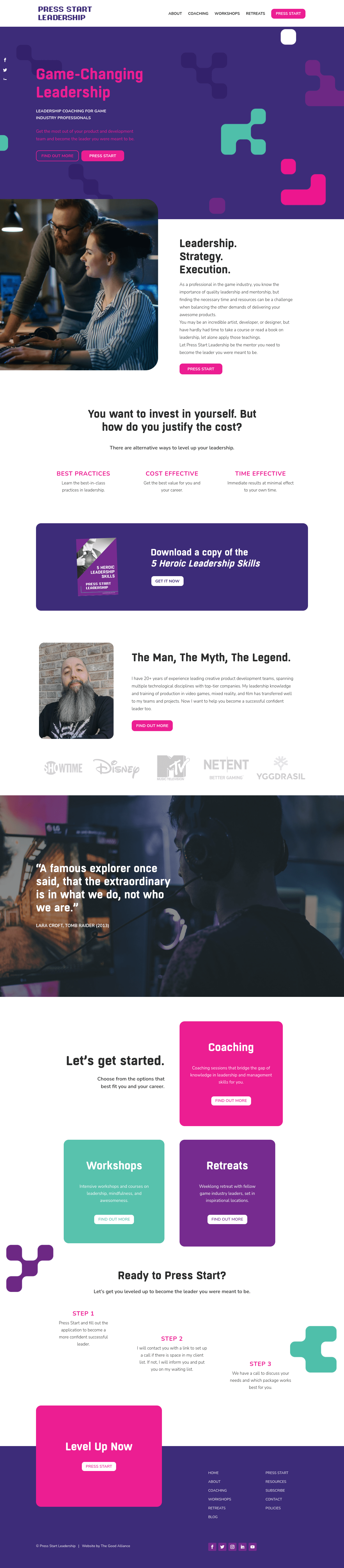
Logo: Simply one of the most on-brand logos you’ll ever see. The old-school ‘animation’ design immediately tells you Chris is in the gaming industry. And the use of the words ‘Press Start’ ties into gaming too.
I can’t say this enough; the logo does everything it needs to before you even start scrolling.
Colour and font: The vibrant pink and purple really make you feel like you’re in a retro video game. And this is continued with the font choice for the headers and subheaders, which has a futuristic, gamer feel.
Content and tone: Having worked in the gaming industry for decades, Chris’ content speaks directly to his target audience – because he’s worked with these people for years.
He also uses a Lara Croft quote from Tomb Raider in place of the usual testimonial. Perfect for his audience, and it shows his fun, playful side.
Visuals: Using a mix of professional images which will resonate in the industry, coupled with Chris’ photo of him looking relaxed with his long, wild beard, it all works.
And the pixel images used throughout the site tie the gaming feel together.
Social media: Gaming and social media seem like a perfect marriage, and Chris’ really is. He even has a little pixelated character of himself across all his channels. And he captures the same style and tone on Facebook, Twitter, Instagram or YouTube.
This is branding executed to perfection.
Overall: Yep, perfection.
Pure and simple.
Game over!
4. Gabby Bernstein
Gabby is a bestselling author, coach and international speaker helping people feel more spiritually connected every day.
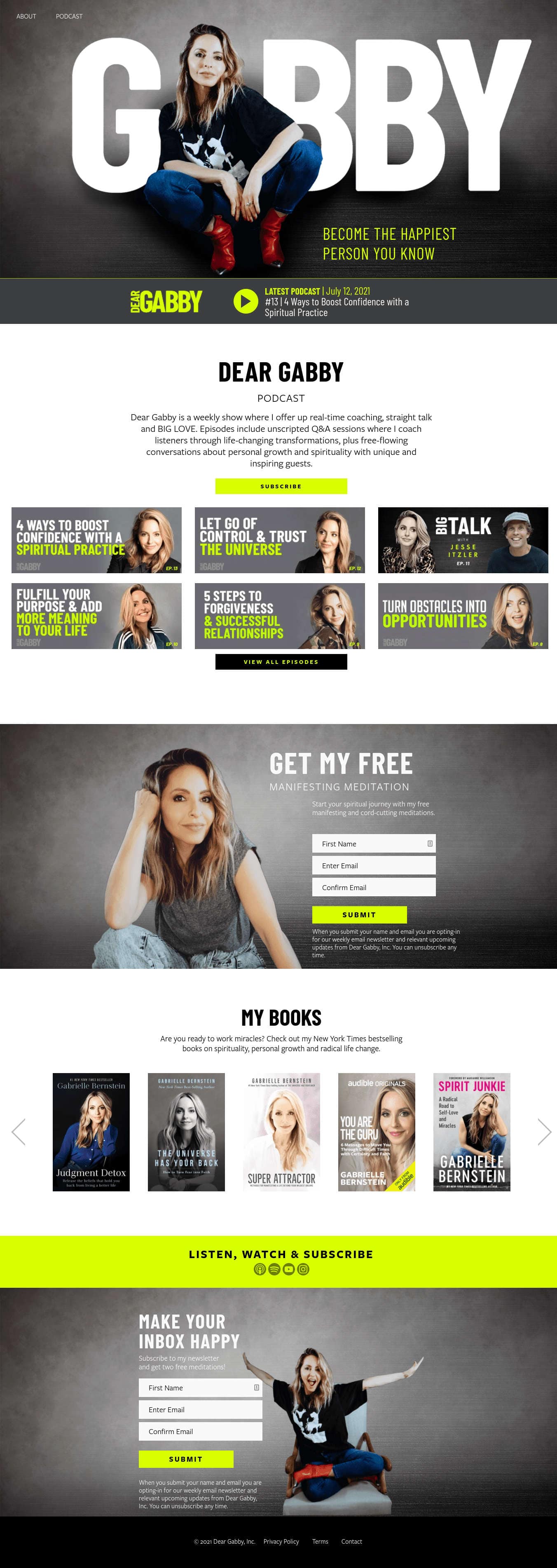
Logo: Gabby’s logo hits you right between the eyes. It’s big. Super big. So big that the real Gabby is the letter A in the logo.
It fits perfectly into her branding because Gabby is the brand, as you’ll learn shortly.
Colour and font: Gabby primarily uses black, white and photos on her website, with touches of lime green. And the fonts are bold and clear, making it easy for her audience to learn about what she does
Content and tone: The content on Gabby’s website is super-helpful and hammers home how important it is to be happy, learn how to trust and have love and meaning in your life.
She wants her audience to feel spiritually connected. And her content gives them countless ways to do that with free resources, including meditations, articles, cheat sheets, podcasts and free guides.
Visuals: Her use of imagery is welcoming and cool. She looks like she’s a kick-ass coach who will get the job done if you work with her.
Social media: Gabby’s branding is seamlessly carried through onto her YouTube channel, as is the helpful content.
Overall: Gabby is her brand. And she’s an incredible example of what can be achieved when you focus on creating helpful content and building a community.
Coaches who work with clients to make them feel spiritually connected would usually go for a ‘zen’ feel, but that’s what is so great about Gabby; she strays from the expected and does her own thing.
She’s different and that really stands out.
5. Heather Waring – Women Walking Women Talking
Heather is a women’s coach who encourages women to set aside time for walking and talking, which has helped clients experience meaningful change within hours.
Logo: For me, this is one of the standout logos on the list. Not only does it have a W for Women Walking, but by incorporating a leaf into the logo, it ties in the outdoors element to her coaching.
It’s all about women getting back to nature, and she manages this in a simple, straightforward logo. Plus, her website is called Women Walking Women Talking, which says everything about what she does in four words – extraordinary!
Colour and font: The colour palette Heather uses varies, from navy blue and white to pink, grey and green. But they work together because they’re all colours you’d see in nature, from the night sky and a storm cloud to an autumn leaf.
Everything feels natural and calming.
And by using a simple font, Heather makes everything easy to understand.
Content and tone: Heather’s content and tone are like taking a deep, relaxing breath. She permits her clients to take a moment for themselves and then taps into how they’re feeling with her own story, which will resonate with her audience.
Her tone is gentle and warm, which makes her coaching technique sound even more enticing.
Visuals: Heather’s visuals are breathtaking, especially the sunburst image in the header. From the off, you feel relaxed and at peace. And she follows this up with pictures of leaves, pebbles and grass.
Just by looking at them, you can feel your muscles relaxing.
Overall: There’s something so fresh and calming about Heather’s website and branding. And the nature theme is incorporated throughout, from the logo and copy to the visuals and colour palette.
It’s like one long, relaxing exhale.
6. Jimmy Turner
Jimmy is a practising anaesthesiologist, entrepreneur and life coach for doctors and medical professionals.
Logo: Jimmy’s logo incorporates the medical caduceus symbol (two snakes with wings entwined around a central staff), which encapsulates his brand as a coach for medical professions.
Colour and font: The fonts used are easy to read, and the colour scheme of navy blue and yellow in the logo continues throughout the website. It’s a strong but approachable colour scheme and font combination that makes the site easy to read.
Ideal for tired and burnt out doctors.
Content and tone: Jimmy includes lots of helpful, valuable and actionable content his audience need, including financial, insurance and contractual advice
This is so important in the US medical profession and could save his clients from wasting hundreds or thousands of dollars
The tone is also light, and you get a real sense of Jimmy talking. He’s got a wealth of experience in the medical field, but he doesn’t overwhelm the reader with jargon – even those his clients work in his industry.
Visuals: Being a doctor is a calling, and you get a sense that Jimmy loves what he does. And that shines through in his choice of imagery. Every picture of him shows him happy and smiling.
He also uses pictures of his family to show it’s possible to have a fulfilling home life alongside a career in medicine.
His face is everywhere, even on his free guides and podcasts, so you know you’re getting the same, consistent advice from the ultimate expert.
Social media: Jimmy’s social media is just as impressive as his website. They link together seamlessly from the visuals to the content on Facebook, Twitter or Instagram.
Overall: Jimmy is so comfortable in his skin. And his experience of overwhelm and burnout is evident in his content
Even if you’re not in Jimmy’s coaching niche, this is life coach branding that’ll inspire you to take yours up a notch.
7. Lisette Leuftink
Lisette is a business owner, coach, legal counsel who works with high-achievers to clarify their mission and become confident enough to dream big and reach a high level of success.
Logo: It’s Lisette’s name, all in uppercase. It’s clear, confident and professional – exactly what she is providing her clients.
Colour and font: The use of colour is minimal, with Lisette opting for a brass and mineral colour scheme, which gives her branding a high-quality, professional look and feel.
While Lisette’s logo font is used throughout the website, she also uses a handwritten font that is easy to ready and feels human and approachable. And the main body copy font is clean and uncomplicated.
Content and tone: Lisette touches on the pain points of her customers and constantly pushes home the message that they can take back control of their life and career, so they can grow again.
The tone is firm without feeling pushy and makes the reader feel they already have the tools they need to transform their life and career. They just need a guide to make it happen.
Visuals: The visuals are professional but not dull. Lisette looks strong and confident but still warm and approachable – definitely someone who knows how her clients feel.
Overall: Lisette’s website looks and sounds confident and professional. She looks and sounds like she has been a success. And, as that’s what her clients want for themselves, it’s a no-brainer for her target audience to choose her.
8. Speech Sisters
Bridget and Burke, aka Speech Sisters, offer online language courses and speech therapy for babies and toddlers struggling to talk.
Logo: The Speech Sisters logo is clean and easy to read, just like the rest of their website. It works because it’s uncomplicated. And that’s how they want parents to feel when they land on their site.
Colour and font: The white, maroon and soft grey colour palette is not only calming, but together it also feels feminine, which is ideal as two sisters run it.
And although the font choices are standard Times New Roman and Impact, they work because they’re classic fonts that don’t distract the reader from the message.
Content and tone: The content and tone are captured perfectly in the very first sentence:
Get your child talking from the comfort of your home.
You don’t have to attend face-to-face sessions or take part in group therapy. You can get your child talking from the comfort of your very own home. For many people, that will come as a relief.
It’s a brilliant first line and the rest of the content is concise and uncluttered, so everything is easy to understand. The tone is beautiful, and by the time you’ve read the homepage, you feel comforted that Bridget and Burke will make your child talk in no time.
Visuals: The visuals, as you’d expect by now, are perfect too. Photos of smiling babies and parents and a welcoming shot of the sisters tie everything together in a neat bow.
Social media: Their Instagram page incorporates the same colour scheme and is packed with helpful stuff parents can use to get their child talking.
It feels like an extension of their website, which is a sure sign of branding done right.
Overall: From their website to their social media, the Speech Sisters’ life coach branding is a thing of beauty.
9. Susan Shaw
Susan is a coach, trainer and speaker who offers mindset coaching to sports professionals.
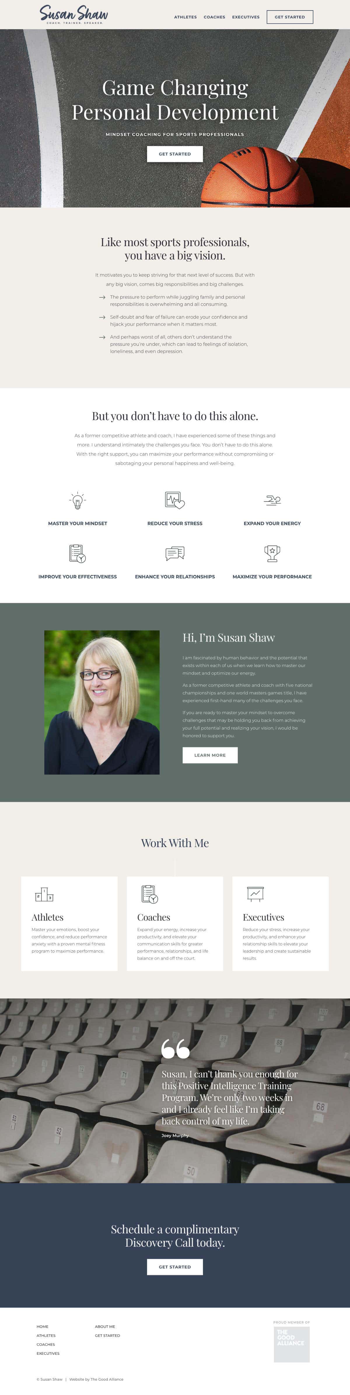
Logo: It’s simple and explains what she does.
Colour and font: While the colour palette might be grey and navy blue, this is perfect as it doesn’t clash with some of the bright colours in the visuals. And the font choices are clean and unfussy, mirroring the choice of colour palette.
Content and tone: Having played professional basketball in her time, Susan’s content and tone tap into the deep-rooted concerns all sports professionals have.
And she lets them know that not only are they not alone, but that the pressures to perform and the worries that go with it are normal.
A sportsperson reading this will connect straight away with Susan’s words. And just like her logo and choice of visuals, the message is clear and uncomplicated.
Visuals: As a former basketball pro, Susan includes a bright orange basketball on a grey court, tying in the visuals to her colour scheme and making the ball stand out against the muted tones.
And her clients, as sports professionals, are recognisable and stand out in their chosen sport, making Susan’s opening visual the perfect metaphor for her clients.
Overall: Susan’s branding is easy to understand and she doesn’t complicate things needlessly. Her clients are busy people, so she doesn’t waste any time getting to the point.
And this is carried through from her logo, right through to her call to action.
10. Zita West – Hug
Zita is a midwife and fertility coach who helps her clients transform their relationships with their mind and body through guided visualisations and online courses.
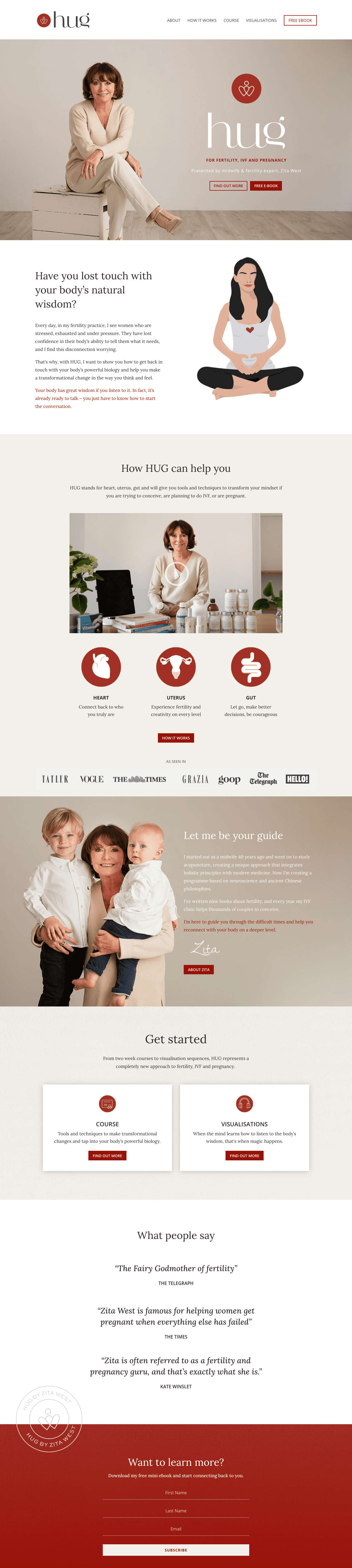
Logo: Entwined hearts hugging a person for a business called Hug?
What more can you say?
Colour and font: The white and grey colour scheme gives Zita’s website a clean, professional, and warm feel. And the font choices are unfussy and easy to read.
Content and tone: Zita’s content takes her clients on a journey to finding the answers to their fertility problems. Whether it’s videos, visualisations, courses or ebooks, there’s a lot for potential customers to take away before they even contact her.
And that she has written books and was a midwife for over 40 years shows she’s got the experience to back up her services.
The tone is very light, warm and understanding – crucial for her target audience who will feel in need of a hug. The tone is spot-on and backs up Zita’s decision to call her business Hug.
Visuals: Zita appears multiple times throughout her website, and each time she is either smiling or looks completely approachable. She also implements professionally drawn images, which effectively explain what she does better than a photograph would.
Overall: Zita’s website is a masterpiece in design, content and imagery. There’s just something so soothing about navigating her homepage and website.
It feels like a warm hug from start to finish – precisely the way she wants you to feel.
Feeling inspired to revamp your brand?
Then we’re sure our ten life coach branding examples will get your creative juices flowing. But if you need more inspiration, check out our articles, 31 best coaching websites of 2021 and 17 health coaching websites to inspire your own.
Or if you need a lot of help bringing your branding up to scratch, why not sign up for our Brand Builder?
Not only will it help you to clarify your vision. But you’ll also learn how to craft a compelling story, develop your brand identity and share it all proudly on a website you’ll be proud to share with the world.
Cat Townsend
Founder of the Good Alliance
After more than a decade spent helping big brands sell more stuff, to people that didn’t need it; Cat set a simple intention: To do more work that made a positive difference in the world. So The Good Alliance was born…


0 Comments