A great coaching organisation can be transformative, unlocking the potential of individuals and teams to reach their goals and achieve success. But with so many coaching organisation websites out there, it can be hard to know how to make your own organisation stand out from the crowd.
Today we’re showcasing some of the best coaching organisation websites we’ve come across. We’ll highlight the website features we love and give you an overview of why they are effective. Plus, we’ll provide links to explore the websites for yourself.
If you are thinking about building your own coaching organisation business then it’s important to have your purpose, promise and offer dialled in before redesigning your website.
Check out our DIY resources for a step-by-step guide to building a brand that works.
10 inspirational coaching organisation website examples
If you’re looking for inspiration for your own coaching organisation website these sites could be just what you are looking for. Out of the thousands of websites out there, we selected these ones for their unique branding, effective messaging and thoughtful user experience. And while we aren’t saying that these sites tick all the boxes of great website design, each one has been picked because it does something particularly well.
So, get ready to discover some of the best coaching organisation websites online today!
(Quick tip: hover over the screenshots below to see the pages in full)
1. EMyth
First up is EMyth. With more than 40 years of experience, EMyth provides proven systems to help small business owners change the way they think about their business and achieve the freedom they’re looking for.

The hand-drawn elements add a sense of authenticity to the website and create an inviting, friendly atmosphere for visitors. The illustrations also help to reinforce the messaging of the website, adding visual cues that draw attention to key points.
2. One of Many
One of many™ is a community and educational hub for professional women who feel called to do more and leave a powerful legacy.

The full-screen video on the homepage instantly immerses you and gives you a real sense of the community they are fostering. Meanwhile, the consistent branding throughout not only their website, but their various assets creates a cohesive experience. More than this though, their brand story is what stands out to us most of all. A compelling brand story helps to further establish their identity, values, and mission, helping them to stand out and build trust with their audience.
3. International Coaching Federation
The International Coaching Federation (ICF). ICF is a global organisation that supports professional coaches and sets standards for coaching excellence. Their website offers all kinds of resources, including an online directory of certified coaches, articles about coaching topics, and even a calendar of upcoming events.
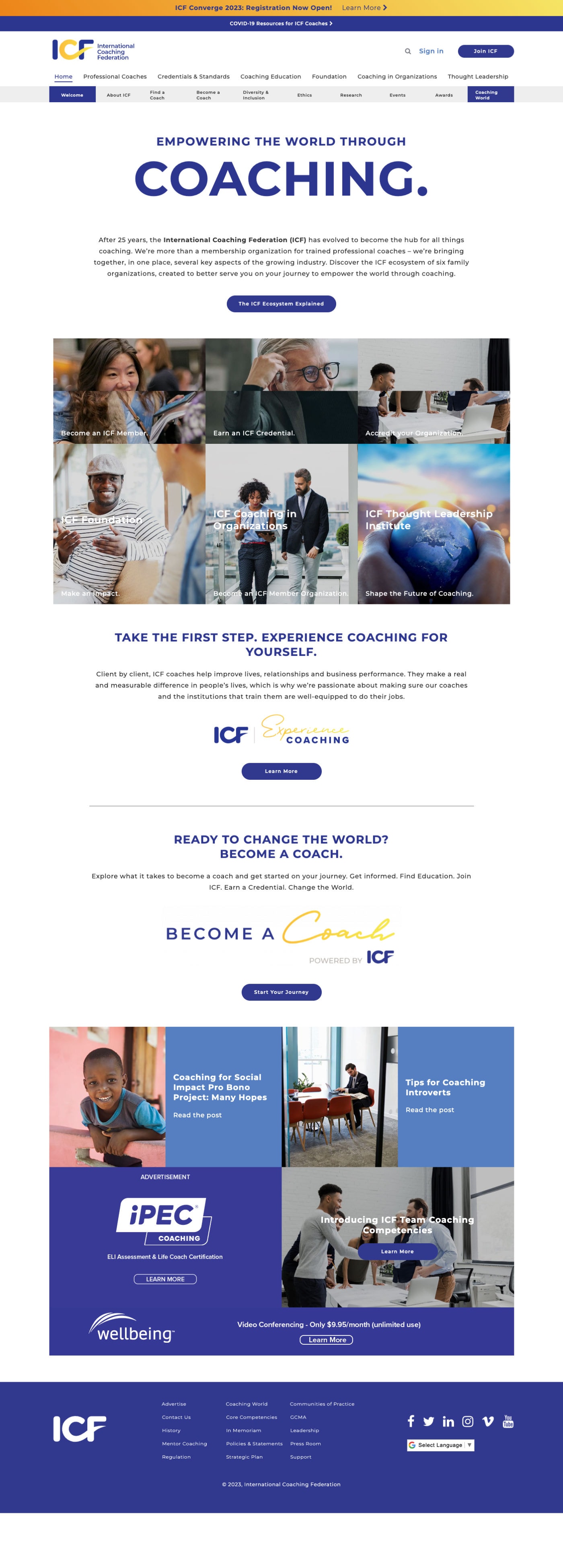
The website also has some interesting design elements that make it stand out; it features strong typography with text in varying sizes to draw attention to the key points on the page. Additionally, the use of contrasting colours – and their signature blue – creates an eye-catching look that is both visually appealing and practical.
4. The Life Coach School
The Life Coach School is one of the more impressive websites on our list; from the moment you land on the website you’ll be captivated by its simple navigation, strong branding, and skillfully crafted design.

5. The Institute of Executive Coaching and Leadership
The Institute of Executive Coaching and Leadership (IECL) has been an industry leader in coach training for more than 20 years, so it’s only fitting that its website oozes style and sophistication.

One of the more surprising elements of their visual style is their selective use of colour. While most of the website follows a muted palette of greys and dark tones, the singular use of yellow creates a powerful effect and draws attention to the important information and calls to action on the site.
6. Positive Intelligence
Positive Intelligence is a global community of coaches, entrepreneurs, scientists, designers, engineers, and leaders. They’re on a mission to help every human build mental fitness so they can fulfil their true potential for both happiness and contribution.

Out of all of the sites on our list, this one may be the one which sparks the most joy. It’s minimalistic, it’s modern, but most of all it’s fun! Through the use of hand-drawn style animations and a bold colour palette, positiveintelligence.com exudes happiness.
The font is another interesting choice. If we were to take it away from the other brand elements it is rather plain (perhaps even boring!), but as part of the complete brand, it is reassuringly clear and perfectly paired with playful imagery.
Aside from its aesthetic appeal, this website has also been designed with usability in mind. All pages are easy to find thanks to a clear navigation menu, and the main content is laid out in an easy-to-follow format. Overall, it is a great example of how good design can be used to enhance usability and create an enjoyable user experience.
7. Agency Mavericks
Agency Mavericks help digital marketing freelancers and agency owners take their businesses to the next level through coaching, online training, accountability, and a strong sense of community.

With blocky headings, grunge backgrounds, clear iconography, and a vibrant colour palette, this website isn’t afraid to mix things up in order to stand out from the crowd. Even so, underneath all of the visual branding, there is a website structure which ensures clarity and consistency throughout. One-word menu items are a great way to keep things simple, as is having one concrete call to action dotted around the site. The Agency Mavericks site is proof that you can have fun with your website design and provide a great user experience.
8. Business Made Simply by Storybrand
The Business Made Simple coaching certification aims to provide a step-by-step plan for coaches to grow their coaching business along with proven frameworks that deliver results to their clients.

The Business Made Simple website might be simple, but the branding is consistent and the website gives the impression that the organisation is professional, successful and trustworthy.
9. British School of Coaching
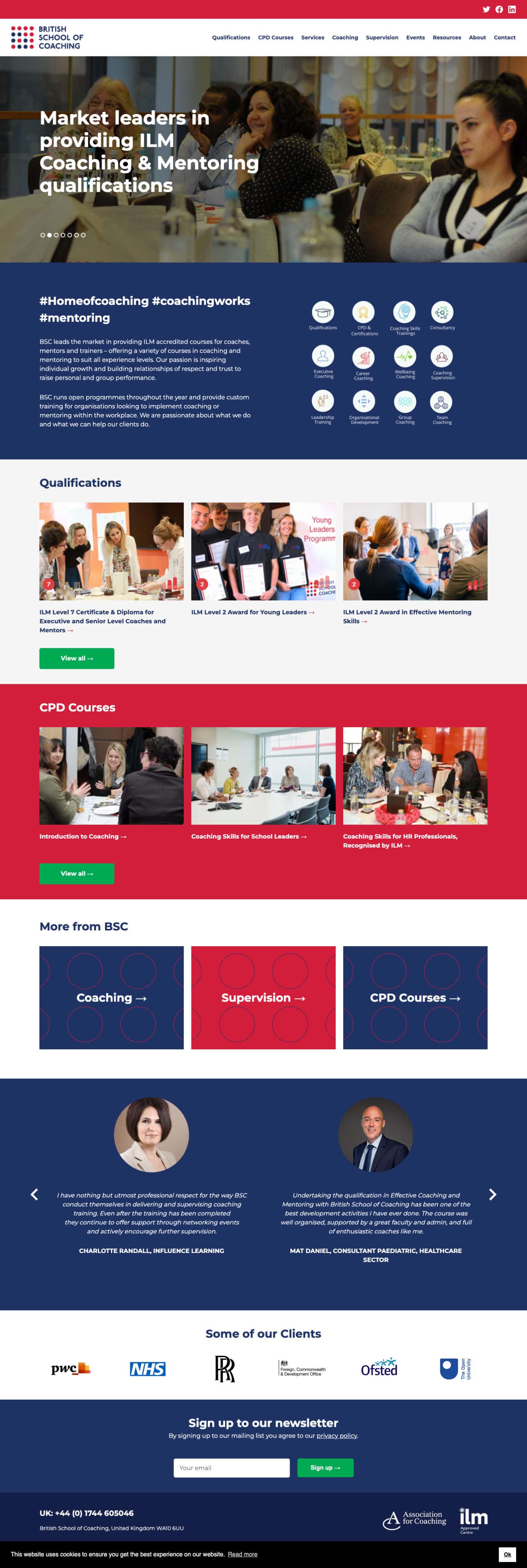
The British School of Coaching (BSC) provides accredited UK qualifications to suit every level of experience in coaching, mentoring, and supervision. What we found interesting about this website is that the design feels like an extension of its brand name.
10. Beautiful You Life Coaching Course
The Beautiful You Life Coaching Course is an ICF Approved Education Provider for people who want to make a difference, see others grow, create their own businesses, and create a life they love.

Proving that websites for coaching organisations don’t all have to have a corporate look about them, the Beautiful You Life Coaching Course website offers a softer, more feminine design than the other sites that have appeared on our list.
With textured backgrounds, hints of gold, splashes of glitter, and eye-catching typography, this site has a unique visual appeal that would strongly appeal to its intended audience.
Another interesting feature of this website is the amount of information that they have fit onto one page. The home page is packed with content, from words to images, and even video content. While we wouldn’t usually recommend this approach and recommend keeping pages light, it works here because all of the information is leading visitors to a single call to action.
Are you ready to make your coaching organisation’s website dreams a reality?
With the right website and branding you can create a successful coaching business that allows you to help others achieve their goals. It all starts with a brand that your ideal client can believe in.
If you’re not sure where to start then our free assessment & scorecard will help you assess your existing brand, and identify your biggest opportunities for improvement. From there you’ll be able to identify your next best steps and make a plan for moving forward.

Brett Worth
Project Success Manager
With a background in web design and development, Brett guides our clients through all aspects of our done-for-you branding experiences.






0 Comments