If you had to make a list of all the traits your clients have in common, I bet “trust” would be at the top of it. More specifically, that they all trust you to have a big and lasting impact on their lives.
Obviously, it’s your ability to guide them towards better outcomes that gives them a reason to trust you. But what about before that? Is there a way to start building trust before they ever get on a discovery call with you?
This is one of the reasons why you have a business website.
But make no mistake: it’s not just the Services or Contact pages that can turn casual visitors or apprehensive prospects into viable leads. Your About page is a great opportunity to educate them about your cause, to explain why you’re so passionate about it and to form a personal connection.
As you sit down to write your About page, keep the following in mind:
1. Include a benefit-driven headline
Start your About page out strong. Don’t do this:
“About Jane Doe, Coach at Large”
Instead, quickly encapsulate who you are and what you do (i.e. the benefits to your clients) in the headline and sub-headline. This way, they won’t land on the page and immediately think, “Oh great, now I have to hear about how great this guy or girl is.”
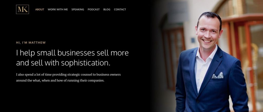
Matthew Kimberley has a beautiful example of how to nail the headline:
It’s friendly. To the point. Benefit-driven.
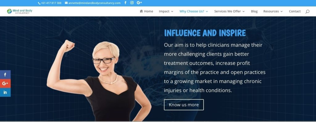
Mind and Body Consultancy is another great example of how to effectively introduce prospects to who you are:
The image is engaging, the headline is strongly and succinctly written, and the message captures what the business does without spouting off a list of services.
2. Use photography to stand out
This page is about you and your brand. It would be kind of strange to introduce yourself and then never give visitors a good look at you. Remember: this is about building trust. Let them know there’s a real person on the other end of the website — and, in the future, their coaching sessions.
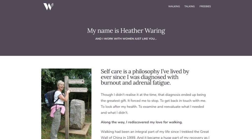
What’s so awesome about this example from Heather Waring of Women Walking: Women Talking is that her photo isn’t a standard headshot. Instead, she’s standing within the context of her coaching business.
If you want prospective clients to see that you’re willing to walk the walk, refer to this example before you select images for your About page.
3. Keep it conversational
The best About pages should sound like they were written by you, not a team of marketing professionals. Again, you’re in the business of making one-on-one connections with clients. If you can’t let them hear the real you with a short video clip, then you need to be able to write your About page to sound like you.
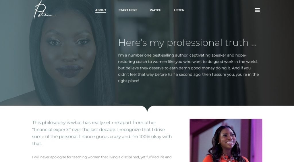
Want to see how this is done? Visit Patrice Washington’s About page.
While her message is buttoned-up, it still sounds very natural.
To do this for yourself, record some phone calls with your clients. Then, write them down word for word. That’s the authentic you, the kind of coach they’re going to meet with and entrust their progress and success to. Make sure your About page captures that.
4. Make it about them, less about you
As for what you actually write about on the page, that’s easy:
Tell them a story.
The only catch is that your client should be the hero of the story, not you. They’re going to visit this page because they want to understand your mission and how they fit into the picture. So, give them that.
As far as how you do that, you have a couple options.
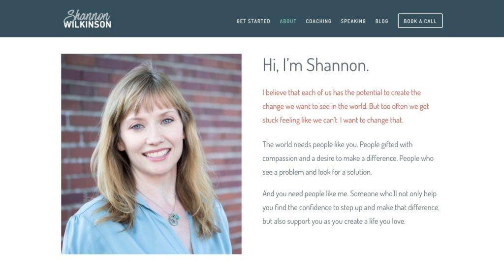
You could do it the way Shannon Wilkinson does where the story summarises the pain of the client.
Note that, even when Shannon proposes that she enter the picture, the dialogue becomes about how “we” will work together to relieve the pain. It’s not just, “This is your life and the problems you have. I enter and solve all of them.”
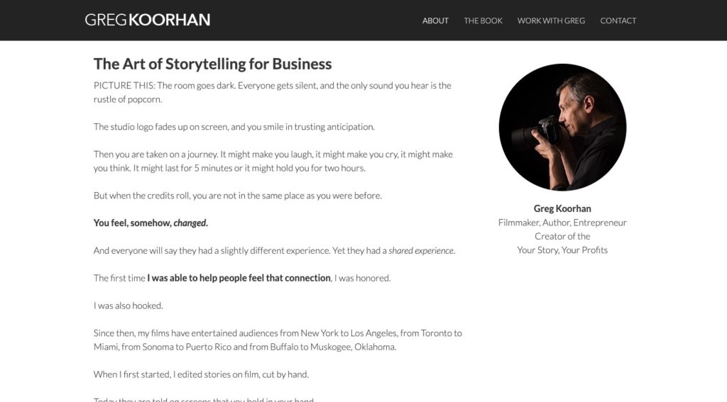
Then, there’s the example of Greg Koorhan. He actually writes the first hundred words or so as a movie script where “you” are the protagonist.
It’s one that suits him well considering he is a filmmaker.
Although he does go on to talk a bit about his own experiences, it makes sense in this context. He needs to show potential clients how he’s mastered the art of storytelling and why he’s the best person to teach them to do the same for their brand.
Just keep in mind that you don’t want to focus solely on yourself for too long. Write your About page like a sandwich, so that the “you” you’re speaking to takes centre stage for longer:
- You
- Me
- You
5. Make it easy to skim
As for how long your page should be, that’s totally up to you. While it should be on the shorter side (like 600 words max), the story you have to tell will ultimately dictate how much you write.
Regardless of how many words end up on the page, make it easily scannable.
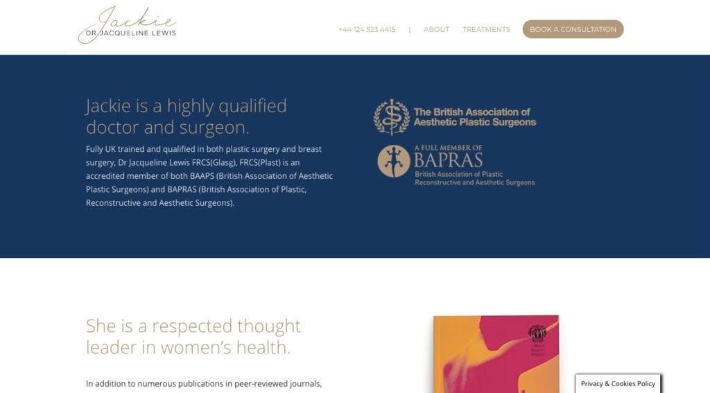
Dr. Jacqueline Lewis’s page is a good example to follow:
The page is broken up into small sections with distinct background colours, images and alignment. This ensures that the visitor stays engaged as they move from topic to topic, even though it all tells the same story.
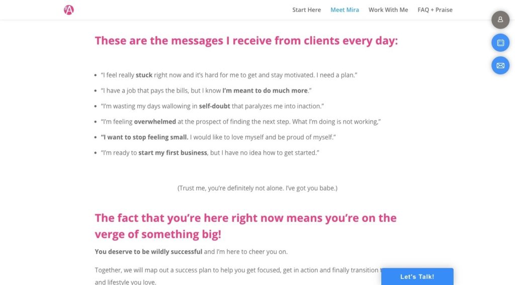
If you’re not comfortable creating those section blocks, that’s fine. You can create text breaks with words as Mira Joleigh does:
There is never a point on the page where someone does not see one of these captivating pink headers. This is nice as it sends the signal that, “Hey, this is easy to read. And if you don’t feel like going all the way through, just read the headers and find the relevant section for you!”
6. Call them to action
Finally, don’t forget to call visitors to your About page to take action. This might not be a sales-focused page like the Home or Coaching pages. However, it’s still meant to convince and convert. So, don’t leave your visitors hanging when they get to the end.
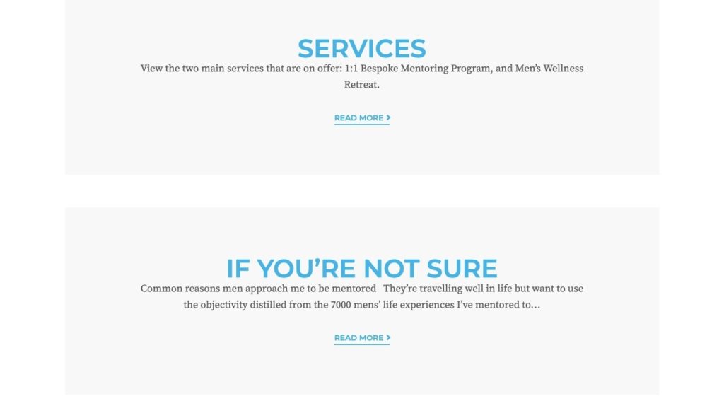
Do as David Ball does and give them an option (or two) for next steps:
In this example, he calls on visitors to learn more about his services. If your Google Analytics data tells you that you have a high amount of traffic coming to this page from Google, that’s a good move. That’s because they haven’t yet had a chance to learn about your coaching services.
That said, if Google Analytics tells you that the About page is more commonly a stepping stone from the Home page to conversion, then the call-to-action (CTA) should be:
Schedule a Discovery Call
And, if you’re not sure which to use, start with the “Book a Call” CTA. If you’ve captured their attention well enough, but they need a bit more convincing, they won’t drop out now. They’ll locate your easy-to-find navigation and explore your services from there. Then book their call.
Have everything you need to write an amazing About page?
The About page should not be viewed as a throwaway page. When you make the mistake of not understanding the true value of an About page, you miss a great opportunity to convert enthusiastic leads at the right time.
Want some help getting your About page set up? How about an entire website? Reach out to The Good Alliance and ask about the Brand Bootcamp.

Suzanne Scacca
Content Writer
Suzanne Scacca is a freelance writer, specialising in web design, marketing, and technology. She also teaches classes at Skillshare and is a sucker for movies, food, and dogs.











0 Comments