What’s worse than not having a website?
Wasting time and money on the wrong website.
Knocking any old website together just isn’t going to cut it these days. Your website is your primary marketing resource, so it’s not only got to look the part, it’s got to say all the right things too.
But before you pull your hair out and need to book an appointment at a hair restoration clinic – relax – you don’t have to do it alone.
In this post, I’m going to show you how to:
- Get clear on what you need your website to do for you
- Decide whether to do it yourself or get someone to do it for you
- Choose the platform most appropriate for your business
- Structure your content, so people read it and take action
- Use colours and imagery to enhance your visitors’ experience
- Plan for keeping your site online, relevant and secure
Ready to get started?
Then let’s go!
Building your website and the decisions you need to make.
Starting a new website project is exciting until you realise it’s a long process, with lots of fiddly bits you either haven’t considered or don’t understand.
Urgh – we’ve all been there.
So, rather than have you hit a brick wall and lose all enthusiasm in your new website, this zero-bullshit guide will help you create a tick-list of things to do, long before you get stuck into building it.
Here are the questions you need to ask yourself:
1. What do you need your website to do for you?
A lot of people who ask us to build them a site don’t actually know what they want it to achieve.
They just feel like they should have one.
For your website to make a huge impact, it should:
- Communicate your message to a larger audience
- Build your credibility and establish you as ‘the person to work with’ in your field
- Sell your services without you even needing to open your mouth
So, grab a cup of tea, a notepad, and a packet of biscuits (because who really eats just one or two?), and jot down:
- Who you are
- What you do
- Why you do it
- How what you offer is unique and a class above what your competitors are offering
Believe me, seeing it written down makes things much clearer, and you’ll have a solid base to work from before you even start putting the words on your website.
2. Do you do it yourself or get someone to do it for you?
Honestly, this depends on several things, and you’ll need to ask yourself a few questions:
a. How technically minded are you?
On a scale of 1 – 10.
Are you skilled at designing and writing, without being a web designer or copywriter?
Or does the thought of going it alone bring you out in a sweat cold enough to freeze penguins?
What’s your skillset?
b. How clear are you on what you need?
Do you know what you want it to look like, sound and feel?
Or are you completely nonplussed?
c. How much of a control freak are you?
I know I definitely fall into this category. When it comes to my own stuff, I’m very particular about everything being just right.
Maybe you just need a mentor?
Someone who can take your ideas and create your vision – while you retain complete control over what goes on your website, and what doesn’t.
d. How much time do you have?
If you’re a control freak, this is the one thing that’s going to push you into hiring someone to do it for you.
Because, honestly, doing your own website can take forever!
Sure, you’ll sit down, crack your knuckles and tell yourself you’re going to get it done in one weekend. But the truth is, no matter how driven you are, you’re going to start, dabble, stick some clothes in the washing machine then procrastinate over it for a few months.
You’re never going to get it finished in one weekend because it’s going to look, feel and read like it’s been dragged through a hedge backwards.
So, set yourself a deadline, and say to yourself:
“If I don’t get this done by September, I may as well get another job.”
Then either hire someone or take action yourself.
3. What platform should you use?
You’ve probably heard of loads of different design platforms.
But how do you choose?
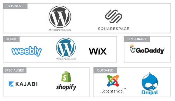
In the diagram below, you’ll find the most common platforms used by web designers, which I’ve split into different groups, based on the type of website they’re used for:
As you can see, I’ve noted Joomla and Drupal are now, mostly outdated platforms, and GoDaddy is used for temporary sites, so I’ll skip over those and talk about the ones which are of more use:
Specialised
Run online teaching courses and want a slick, front end website?
Then Kajabi is going to help you showcase your work in the best possible way. It’s not for everyone, but if a lot of what you do is focused on getting customers to sign up for classes or courses, you’ll want to invest in Kajabi.
Got an online store? Selling products your customers won’t be able to resist?
Then Shopify is worth a look. It’s geared towards eCommerce, which means it’s safe and secure, and you don’t need to install some of those faffy plugins you have to on other platforms.
Hobby
These websites all do, kinda, the same thing.
They all have free templates to get your page up fast, but they’re not massively flexible, and they’re not future proof either. Which means, if you want to up your SEO game or want a cool, modern look, they’re not going to help you do that.
However, they’re ideal for creating a small site, or for attempting some basic web design out for yourself.
Business
The most popular content management system in the world – and for good reason.
WordPress.org is future proof, which means it’s continuously updated with new and amazing plugins and themes that’ll keep your website looking and feeling modern.
If you want a slick-looking site, Squarespace has some fantastic ‘out-of-the-box’ themes that’ll make your tongue roll out of your head.
The only drawback is, unlike WordPress.org, if you want to set up things like, say, a shop, you’ll have to pay extra to do so. It’s not a deal-breaker, so if it’s all about the ‘look’, take a peek at their kick-ass designs.
At The Good Alliance, we use WordPress.org with Divi by Elegant Themes. Divi is an easy-to-use ‘drag and drop’ website builder, similar to those used by Squarespace, Weebly and Wix, with hundreds of theme and customisation options.
If you know your way around similar theme builders, like Elementor, Live Composer and OnePager, you’ll love Divi.
But that’s only the beginning. To futureproof your website, keep it current and fight against pesky hackers, etc. you’ll need to keep it up to date, and you can do that by:
- Updating WordPress software (if you decide on WordPress)
- Updating Themes
- Updating and managing Plugins
- Keeping your design and content up-to-date (remove anything irrelevant or no longer works)
4. What content should you include?
So, you’ve got your design sorted, or you’re thinking about what you want, which means the next step is thinking about your content. And it’s tempting to run wild telling your customers:
- How great you are
- The journey you’ve taken to get where you are
- How you’d like to thank your partner, kids and the cat
But before you do that:
STOP!
Honestly, it sounds harsh, but your customers don’t really care about you.
If you want them to give you a call, send you an email, subscribe to your newsletter, enrol on your course or purchase your product, don’t tell them your story, tell them theirs.
And the best way to do that is by asking yourself the following questions:
- Who do I want to take action?
- What action do I want them to take?
- What would they need to feel to take that action?
- How ready are they for what I’m offering?
- How long will they take in deciding to take action?
- What could put them off taking action?
Once you’ve got your answers, you need to make sure your content is written with the customer in mind. So, use one of the most powerful words in marketing:
You.
Yep, even though it’s only a three-letter word, You is stronger than Wonder Woman, Superman and a post-spinach Popeye all rolled into one.
It shows your customers you’re talking to them, as an individual, which is a great start when writing your brand story, and the best way to do that is by:
- Making your ideal customer the hero of your stories
- Exploring their obvious and not so obvious problems
- Setting yourself up as a guide
- Presenting a simple solution
- Providing a reason (and a means!) to take action
Making it about them, showing you understand their problems and giving them an easy answer to their questions is what’s gonna make them come to you time and time again.
So, give them what they want!
5. How do you structure your content?
Cramming everything in all at once may feel like the thing to do, but people hate pages rammed with text, pop-ups and hundreds of links.
Instead, keep it simple, and structure your content like this:
- Create a one-page website. It beats a complicated fifty-page site any day
- If you want multiple pages, keep your main menu super-simple with just 2-4 link options. Use a footer menu, for anything else
- Don’t send people away from your site, especially to social media
- Know your brand story. Use it. Stick to it
6. Which colours should you use?
The colours and images you use need to reflect you, but it’s not merely a case of choosing whatever you like.
Every colour has its own psychological meaning, so you need to work out which colours will have the desired effect on your customers.
So, how do you work out the right ones for your business?
You need to ask yourself:
“How do I want to come across, and how do I want my customers to feel when they visit my site?”
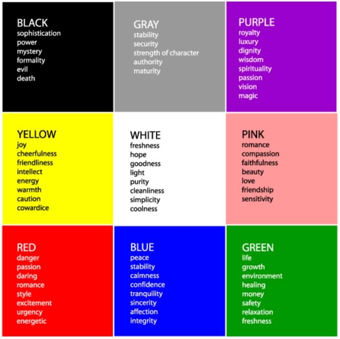
Whatever the answer, there’s a colour palette for it. And to give you a helping hand, here are a few colours and their main psychological traits:
Select colours that align with how you want to come across and how you want your customers to feel.
Try them together to see if they create the feeling you want and, most importantly, be consistent by using the final palette across all your platforms.
DIY or hire an expert – it’s up to you…
Phew, that was a lot to take in, right?
And you can now see why it’s more than just a ‘one-weekend’ job. By taking the time to work out what you want and who you want to target beforehand will make things much faster once you start your design, or hire someone to do it.
If you’re having a crack yourself, either at building from scratch or updating what you already have, we’ve written more helpful stuff in our free ebook: The ultimate guide to upgrading your coaching website (believe me, this thing is epic!).
Or, if it’s clear a DIY job just isn’t for you, take a look at our Brand Bootcamp program. We’ve redesigned and launched websites for dozens of coaches that not only look and sound the biz but also engage their clients too.

Cat Townsend
Founder of the Good Alliance
After more than a decade spent helping big brands sell more stuff, to people that didn’t need it; Cat set a simple intention: To do more work that made a positive difference in the world. So The Good Alliance was born…









Every time I have read anything you have written on building a website. I am inspired, gained knowledge, and feel like I have to go and do a revamp.
Thank you for sharing.