Your website is the most important part of your business.
That’s a pretty bold statement, right?
But I stand by it.
Why?
Because it has the power to:
- Excite your target audience
- Make them feel emotion through words and images
- Build trust in your business
- Turn you into an industry expert
- Win you business
- Make you money
Yowza – that’s pretty powerful!
However, websites age fast, which means if you’ve barely touched yours in two to three years, chances are potential customers are clicking away.
So, why do visitors leave your website?
Five reasons why customers leave your website
If you’re not generating leads through your website. Or your analytics show your visitors aren’t going any further than your home page, there will be several reasons for this.
Here are five of the main culprits:
1. It looks rubbish on mobile devices
A whopping 52.9% of website traffic in 2019 was on mobile phones.
So, if your website isn’t set up for mobile devices, it won’t adjust to fit the screen. It looks unprofessional and visitors aren’t gonna stick around.
2. There’s no clear call to action
What do you want a visitor to do when they visit?
Call? Email? Book a free consultation?
If there’s no clear call to action on what you want them to do or where they need to go, they’ll give up.
3. There’s no easy way to contact you or book appointments
If you’re not giving visitors forms to fill in or buttons to press, they’re unlikely to click on the designated ‘Contact’ page any more.
And if that only consists of your email address, they probably won’t contact you at all.
4. The design looks unprofessional or dated
Your website should be a feast for the eyes.
It should look slick, professional and be easy to navigate.
Poor quality images, dated fonts (hello, Comic Sans!) and clunky design that’s difficult to navigate are gonna make them run a mile.
5. It’s all about you and offers no value to your customers
Your customers want to know how what you do positively benefits their life.
Endless stories about yourself and how you couldn’t have done it without your partner, kids, gerbil and that geranium you’ve kept alive for 15-years aren’t going to interest anyone other than yourself.
Coaches who keep customers on their website
Let’s be honest. Your site probably isn’t suffering from all the above. However, if one or two sound like some of the issues yours has, here are five kick-ass coaching websites doing it right:
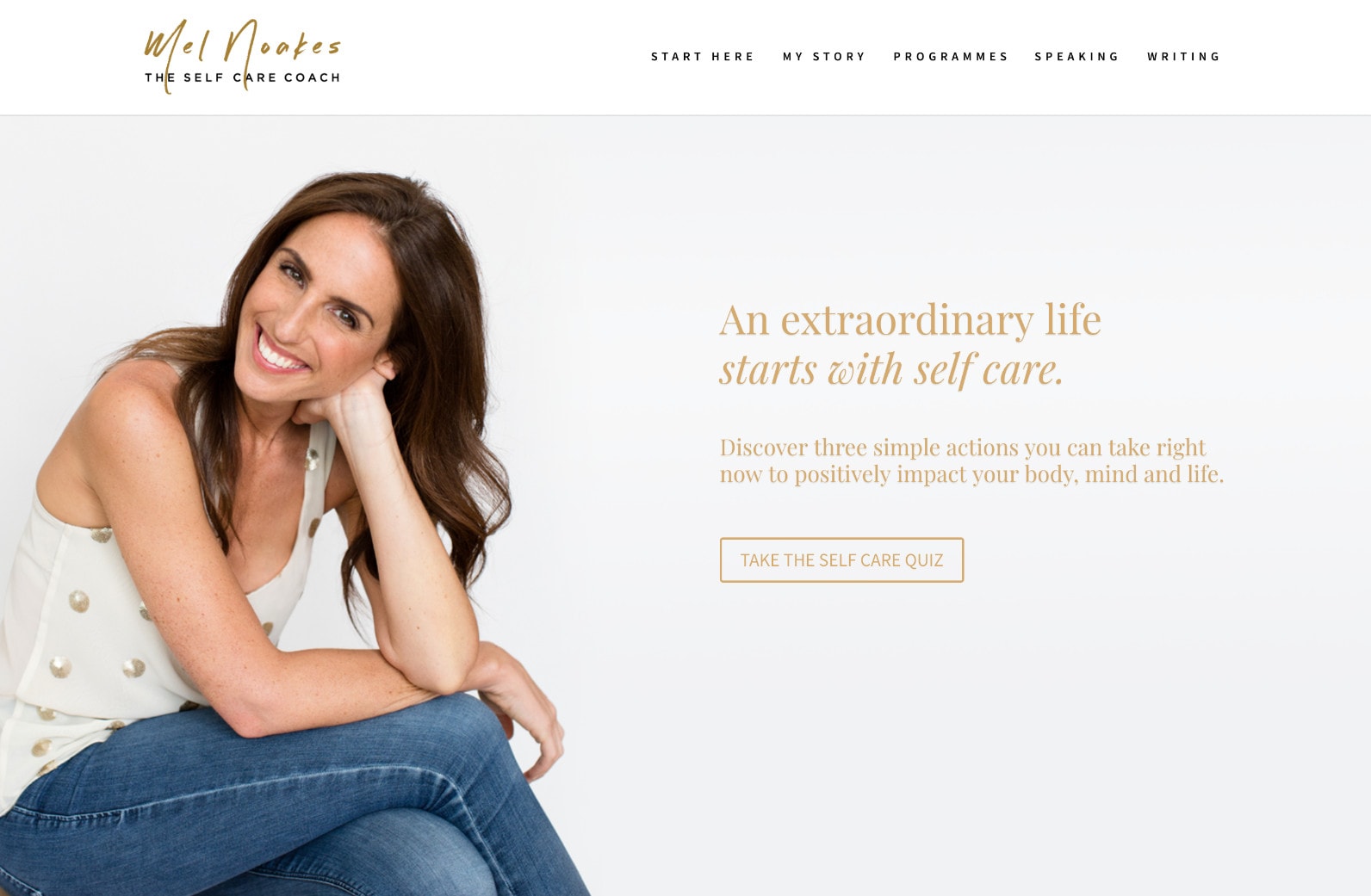
1. Mel Noakes
Why it rocks: It looks great on mobile devices.
Mel’s mobile-friendly website looks gorgeous and is the perfect example of a mobile site done right!
Striking photography, modern fonts and lots of ‘space’ allow it to breathe, even on a small screen.
It’s a joy to navigate.
2. Cortney McDermott
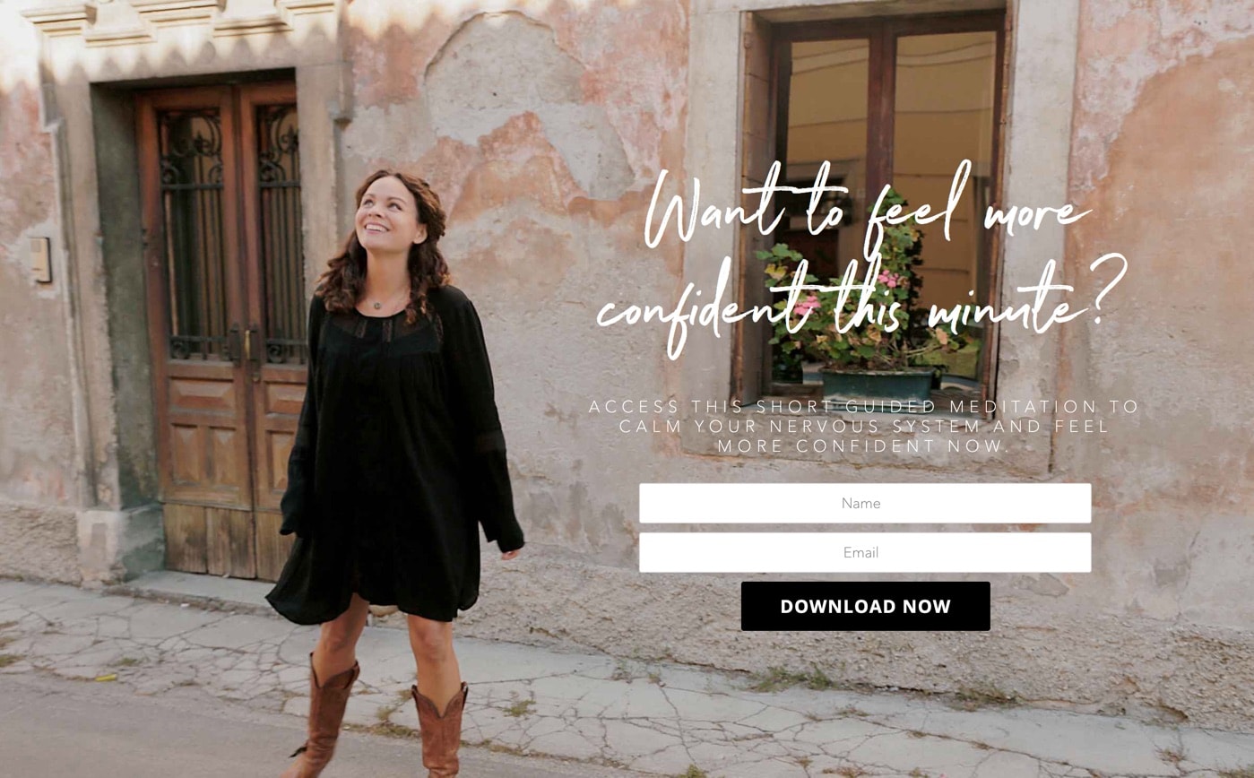
Why it rocks: There’s a clear call to action.
Cortney uses a question for her call to action: “Want to feel more confident this minute?”
And it’s clear what she wants visitors to do, access a short, guided meditation. But Cortney goes further than most, she uses an image of herself in the background.
It’s not like that by chance, it’s there to build trust. And, in this case, the image is there to evoke feelings of happiness and confidence, something her audience want to feel in their own lives.
3. Fiona Ross
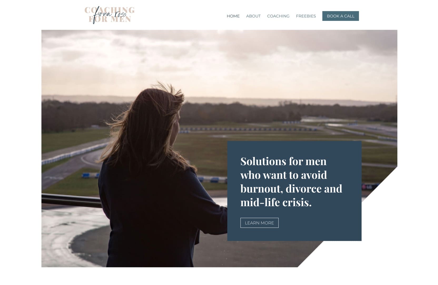
Why it rocks: It’s easy to book a call.
Fiona keeps her call to action short and to the point. She invites her audience to take the first step in changing their lives for the better, and rounds it off with a simple ‘Book A Call’ button.
And, when you click that, her booking page makes it simple to get in touch.
Perfect!
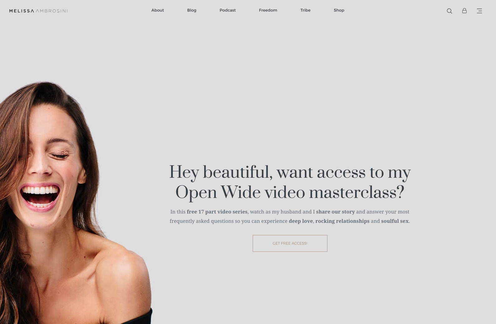
4. Melissa Ambrosini
Why it rocks: The design is modern and fresh.
Melissa’s website is the gold standard of modern website design.
Clean, clear, easy to navigate and packed with information, without looking cluttered or clunky.
It’s a breath of fresh air!
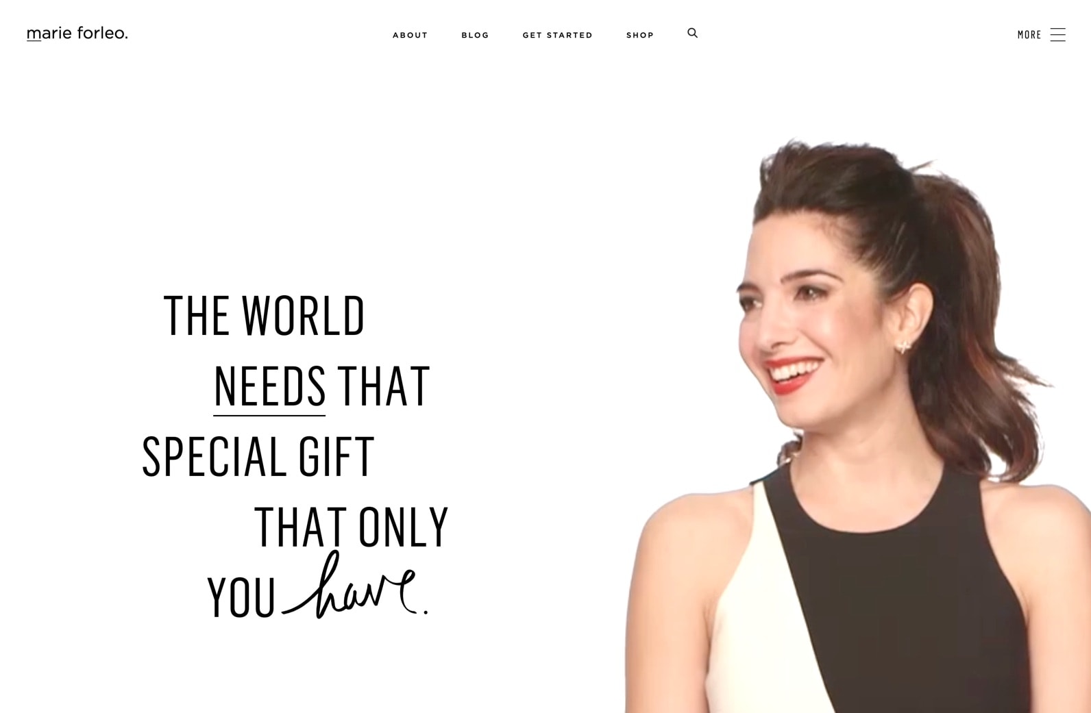
5. Marie Forleo
Why it rocks: It’s all about the customer.
Every section of Marie’s website is carefully tailored to her customers:
- The world needs that special gift that only you have.
- You don’t have to get it perfect. You just have to get it going.
- Learn how to get anything you want.
- MarieTV will motivate you with wit and wisdom to build your dreams.
- It all starts with you.
Marie’s website isn’t all ‘me, me, me’ it’s all about empowering her audience by making it about them.
And she does that by using ‘You’ and ‘Your’ in all the right places.
Make your customers stick around
A little rewording here, a tweak in the design there and you can improve your website massively. So, if this sounds like something you’d like to have a crack at yourself, check out our post: 10 coaching websites with an irresistible call to action to get you started on writing a killer call to action.
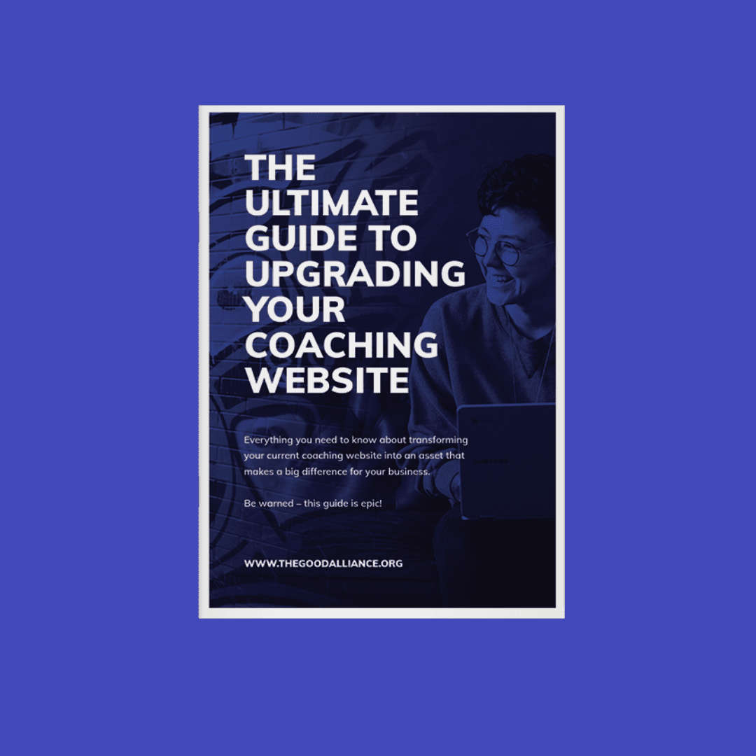
However, if your website is in need an upgrade but you’re stuck over where to start, visit our Resources page. We’ve helped dozens of coaches realign their business message and brought their site design into the 21st century.
Your website is the most important part of your business, so make sure yours is working hard for you

Matthew Drzymala
Copywriter & author
Matt is a freelance copywriter, specialising in whatever you throw at him. He’s also an author, runs writing workshops in schools and has hyper-mobility in his thumbs.





0 Comments