The ‘About’ page, other than your homepage, is one of the most visited pages on your website.
But unlike your home page, which is there to help someone understand:
- What you can help them with
- What services you offer
Your about page is where you cement trust and connection.
When people visit your about page, they’re looking to find out more about you and find answers to questions, like:
- Who’s behind it?
- Do you seem credible?
- Do you seem like the type of person/business they’d like to work with?
That’s why it’s useful to include details on your about page that tell your customers:
- How you got started
- What makes you different from your competitors
- Your values and beliefs
- Why they should choose you
Great, right?
But have you ever tried to write one?
They’re hard – really hard.
Most business owners struggle with them because they don’t know what to include on the page or how to lay it out.
Mistakes people make on their ‘About’ page.
In the past, about pages read like a personal history with detailed descriptions about:
- Where you grew up
- The jobs you’ve done since leaving school
- The loooong version of how you started your business
- Everyone you’d like to thank, including friends, family, children and pets
Do that now and visitors will click away.
But that’s not even the worst part.
Some businesses commit the cardinal sin of not having an about page at all.
Big mistake!
Customers expect to see one, and a website without one just doesn’t look or feel right.
Or some businesses decide that ‘About’ sounds boring, so call it something bonkers, like ‘Personal’ or ‘The Brain Hub’ instead.
Make it easy for your audience and just call it ‘About’, ‘About Me’ or ‘About Us’.
Why you need an ‘About’ page.
Still not convinced having one makes much difference to your business?
Then here are three more reasons why you need one:
1. It creates a relationship with your target customers
By showing who you are and what your brand stands for, you build trust in your business. And even if your audience doesn’t need you right away, an engaging about page will help them remember you when they do.
2. It’s one of the first pages new visitors look at.
It’s not one of the most visited pages on your website for no reason. As humans, we’re curious about reading stories and learning more about the people behind the brand before we purchase anything.
Your about page can sway a potential customer to invest time and money into your products or services.
3. It tells people why you’re different
Nobody else runs their business like you do. It’s completely original. So, tell your audience your unique story and what’s so different about how you do things. A story customers can relate to will make you stand out even more.
How to write yours.
Now you know the benefits of having an about page, it’s time to bring it all together to make it enjoyable to read and look at.
So, with that in mind, below are six tips to help you write an awesome one:
1. Start by positioning your value proposition above the fold
Sounds complicated?
It isn’t.
What it means is is the section of the screen visible before a visitor has to start scrolling.
So, start with the most important information here, like what sets you apart from the competition.
Capture your audience’s attention from the off and they’ll be more likely to read on.
2. Then move on to your story
Nobody has a story like yours, so make sure you tell your visitors your own unique tale.
But even though it’s your story, here’s a copywriting tip: Don’t make it all about you.
Yes, your story is why you got into doing what you do, but make it relatable to your audience. Touch on their pain points and mention similar struggles you’ve been through.
After all, your business provides a product or service that most likely helped you in the past.
Or you’ve created it because it didn’t exist when you needed it.
Tell your story, but find the threads that tie your audience into it.
3. Use subheaders to break up your story
A wall of text will put off even the most enthusiastic reader, so break your story up with subheaders.
Think of where you can use a dramatic headline or where you can naturally turn the story from the problem to the solution.
It helps your page flow and makes it less overwhelming to read.
4. Back up claims with statistics and social proof
Try and be as specific as you can, rather than using sweeping statements. And if you claim your business does something, prove it with stats, testimonials or case studies.
If your audience can see proof that it works, they’ll trust it’s going to work for them.
5. Include a rousing call to action
Don’t just end your page by saying ‘Thank you for reading’. Use a subheader asking them to get in touch, followed by a reminder as to why they need to work with you.
6. Don’t forget to add a contact form or ‘Book a Call’ button
Never ask the reader to visit your ‘Contact’ page. More often than not, they won’t. Instead, include either a contact form or a ‘Book a Call’ button at the end.
Lots of businesses don’t include one: big mistake.
Give your visitors the chance to get in touch with you on every page and you’ll stand a better chance of increasing your leads and sales.
Other things to include.
Following the above tips will make your about page flow better, but there are a few more things you can add to make yours stand out even more, like:
1. Your full name
It sounds obvious, but many business websites don’t include a name on their about page.
They refer to themselves as:
- Me
- I
- Us
- We
But completely forget to mention their name.
Whether you’re a one-person company or have fifty staff, using a name makes it personal. Straight away, there’s a human connection and it feels much warmer.
And with that in mind…
2. Include your photo
Many people forget to include an image of themselves. Like using your name, a smiling photograph creates a connection.
They’re easy to forget, so make sure to include yours.
3. Include your credentials
If you have any certifications or awards that boost your credibility, include them. Not every business owner will need to, but if a PhD or Diploma gives you an advantage, mention them.
4. Mention sustainability practices and values
If your business is taking action in reducing your carbon footprint, mention it and use an eye-catching photo to prove it.
You’d never have mentioned this on an about page until fairly recently, but now it’s vital.
In a study by SmartestEnergy, it was found that 81% of consumers prefer to buy from sustainable sellers, so if you’ve implemented practices to reduce your carbon emissions, include them.
It can be enough to sway those customers who are still on the fence.
And mention your values too.
When your beliefs and values align with your customers, it’s a sure-fire way to guarantee they’ll bookmark your page and tell everyone how great you are.
5. Use video
This one isn’t for everyone, but a video on your about page can make you really stand out.
Why?
Because not many businesses do it.
So, if you include one, make sure it’s short, interesting and helpful – and no more than 30-seconds.
Oh, and script it.
Writing down key points and sentences you want to use helps you to include only the most essential information, and you’ll spend less time on retakes too.
6. Write in a conversational tone of voice
Remember, this page is YOU talking, so why would you write in a bland, monotonal voice?
Throw off the shackles of corporate-speak and have fun by:
- Being yourself
- Using words you’d use if talking one-to-one
- Cutting out confusing jargon
- If it’s right for your audience, be funny too
If your homepage has to be a little formal, no matter what you do, your ‘About’ doesn’t have to be.
As I say at the top, remember, this page is YOU talking.
You’re telling them about how you can change their lives and solve their problems – showing your personality is so important in winning clients and making sales.
It doesn’t matter if you’re talking to IT consultants, new mums or teenagers with low self-esteem. A conversational tone is appropriate for all.
That doesn’t mean swearing and being inappropriate. It means sounding chatty in a way that resonates with your audience by using words they’ll relate to.
People buy from people, so let the real you shine through.
An example of an awesome ‘About’ page.
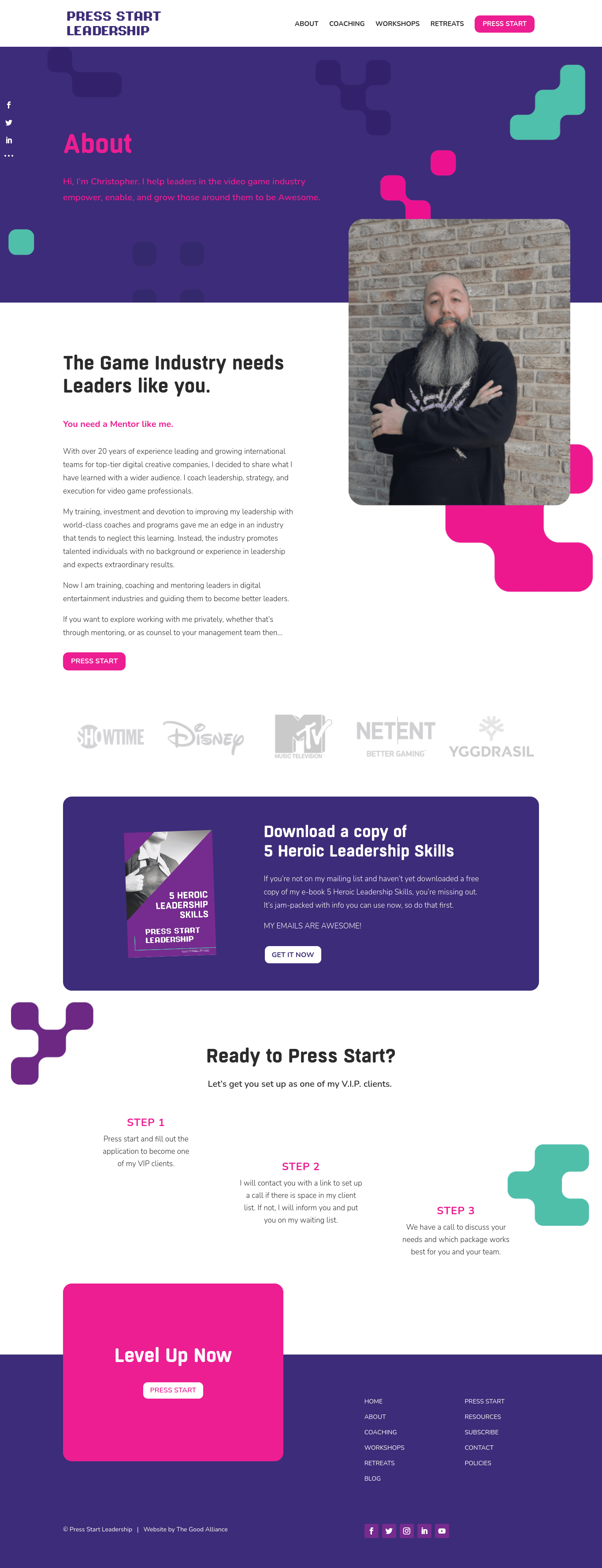
There are a lot of great examples out there, but one of our favourites is by Christopher Mifsud of Press Start Leadership.
What makes it so great?
Easy – Christopher uses a combination of engaging words and branding that resonate with his ideal clients.
He starts with a short introduction as to who he is and what he does. Then makes his clients the hero of their own story by telling them in his headline:
The game industry needs Leaders like you.
Before positioning himself as the logical step to the next level in his subheader, by saying:
You need a mentor like me.
His story is just four short paragraphs and includes some heavy-hitting client logos from the likes of Disney and MTV. And to make life easy for his clients, he includes a simple 3-step guide on how to work with him and a bold call to action button.
And that’s it!
Short and sweet.
To see more of Christopher’s awesome website, visit Press Start Leadership. Or, to see more examples of awesome about pages, check out our article, 11 coaches who totally rock their ‘About Me’ page.
If writing isn’t your thing, why not work with us?
If your about page could do with an update. Or your website as a whole needs a little more love. Why not apply to work with The Good Alliance?
We’ve helped hundreds of coaches, consultants, non-profits, charities and social enterprises reach their target audience with a modern design or a little refresh of their written content.
And for more helpful writing tips, check out our articles, 10 ways to write engaging website copy and 5 reasons why you’ve got writer’s block.

Matthew Drzymala
Copywriter & author
Matt is a freelance copywriter, specialising in whatever you throw at him. He’s also an author, runs writing workshops in schools and has hyper-mobility in his thumbs.










0 Comments